How to test responsive design on multiple devices at once
A practical workflow for checking a website on phones, tablets and laptops at the same time: which sizes to pick, what to check and which tools help.
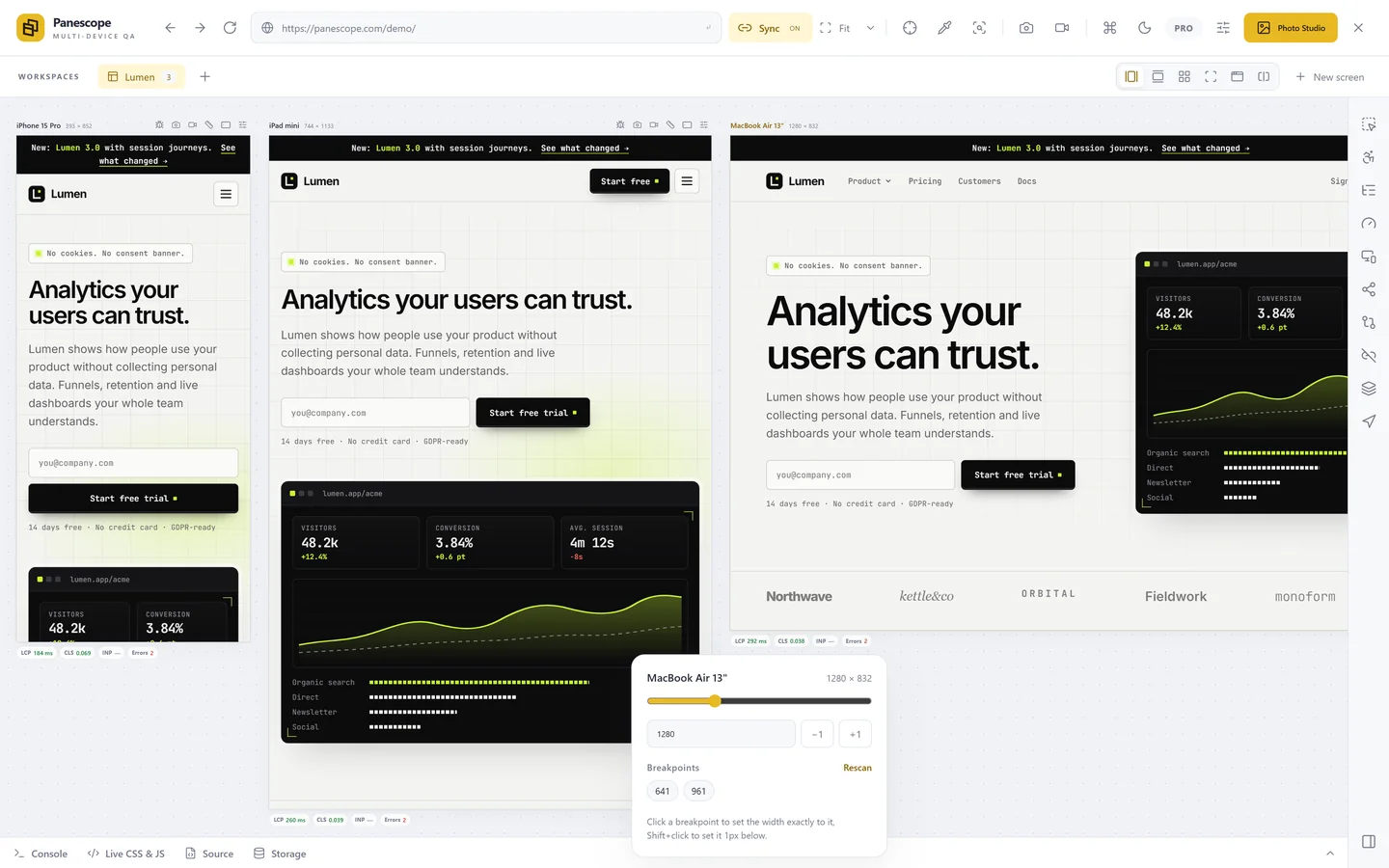
Resizing one browser window is how most of us start testing a responsive site, and it is why so many layout bugs ship. You see one width at a time, you forget what the last width looked like, and you never see the page the way three different visitors see it at the same moment. Testing several devices at once fixes that.
Why at once, and not one after another
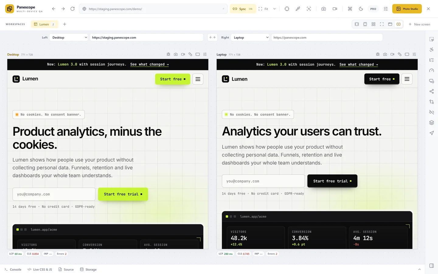
Bugs in responsive layouts are rarely about one size. A card grid that looks perfect at 1440 px wraps badly at 1280 px; a header that fits on a 390 px iPhone overflows on a 360 px Android phone. When the sizes sit side by side, the difference jumps out. When you check them one by one, you are comparing against your memory.
Step 1: pick a small, deliberate set of sizes
You don't need fifty devices. You need the edges and the middle of each class:
- Small phone: 360 × 800 (many Android phones) or 375 × 667 (iPhone SE).
- Common phone: 390–430 px wide (iPhone 14 to iPhone 17 Pro Max).
- Tablet: 768–834 px portrait (iPad mini to iPad Pro 11), and a tablet in landscape.
- Laptop: 1280–1512 px, the width most people browse at.
- Large screen: 1920 px or wider, where max-widths and background images show their seams.
Our viewport size table lists the exact CSS sizes and pixel ratios of current devices.
Step 2: open them side by side, in sync
A multi-device tool shows every size as a real, interactive page and repeats what you do in one screen in all the others. In Panescope you click the extension icon on any tab and the page opens in a workspace of screens; scroll, click, hover or type in one and the others follow.
Step 3: walk through the page like a visitor
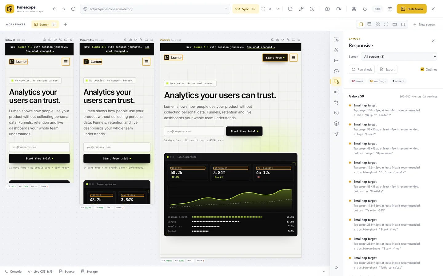
With the screens in sync, go through the page top to bottom and through one real task, such as signing up or checking out. Look for:
- Horizontal scrolling on the smallest phone (see how to find what causes it).
- Text that wraps into one word per line, or headings that clip.
- Tap targets that become tiny or crowd each other.
- Menus and dialogs that open off-screen or can't be closed on touch.
- Images that are blurry on high pixel-ratio screens or too heavy on phones.
- Sticky headers and footers that eat half of a short landscape screen.
Step 4: change one condition at a time
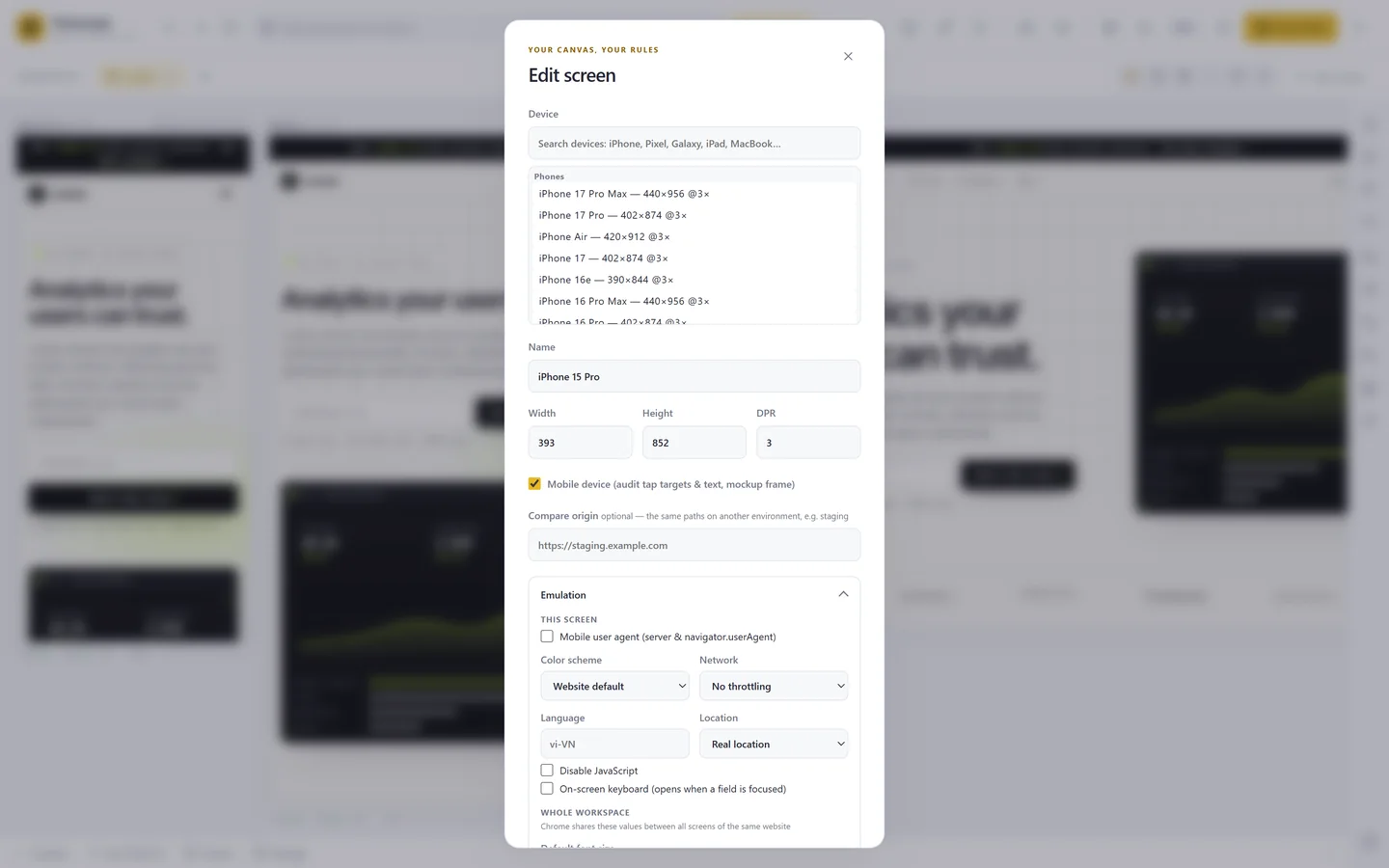
Once the layout holds, vary the conditions real visitors bring: dark mode, a slow network, a larger default font size, reduced motion, a different language. Panescope sets these per screen, so a phone on a slow network can sit next to the same phone on Wi-Fi.
Step 5: confirm on a real device
Every desktop tool renders with your desktop browser's engine. Chrome-based tools such as Panescope show you Chromium at the size and pixel ratio of an iPhone, not Safari on iOS. Layout bugs show up the same way, but a final pass on a real iPhone or an iOS simulator catches the Safari-only quirks.
Panescope is free for up to 3 screens. Pro for 3 days, no card needed.