Responsive design testing tools in 2026: an honest list
From free built-in browser tools to dedicated multi-device browsers and real-device clouds: what each kind of responsive testing tool is good for.
Responsive testing tools fall into four families. Each one answers a different question, and most teams end up using one from each of the first three.
Built into the browser
Chrome DevTools device mode and Firefox Responsive Design Mode are free and always there. They emulate one device at a time with its size, pixel ratio, user agent and touch. Ideal for a quick look; slow for comparing sizes. See what device mode doesn't show.
Multi-viewport tools
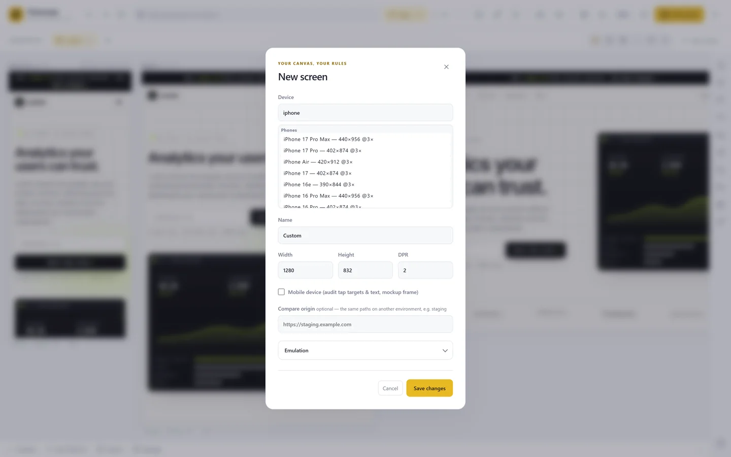
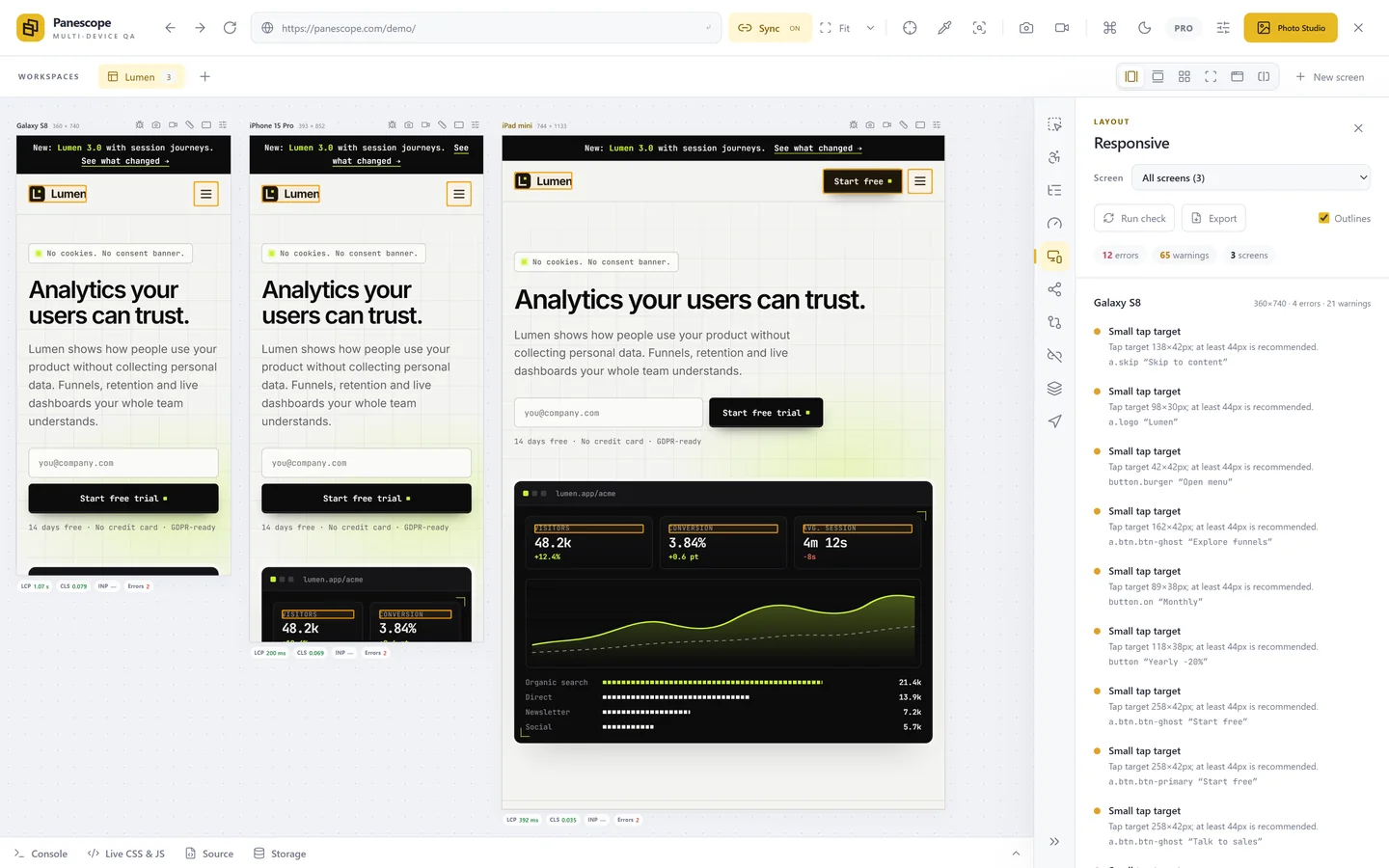
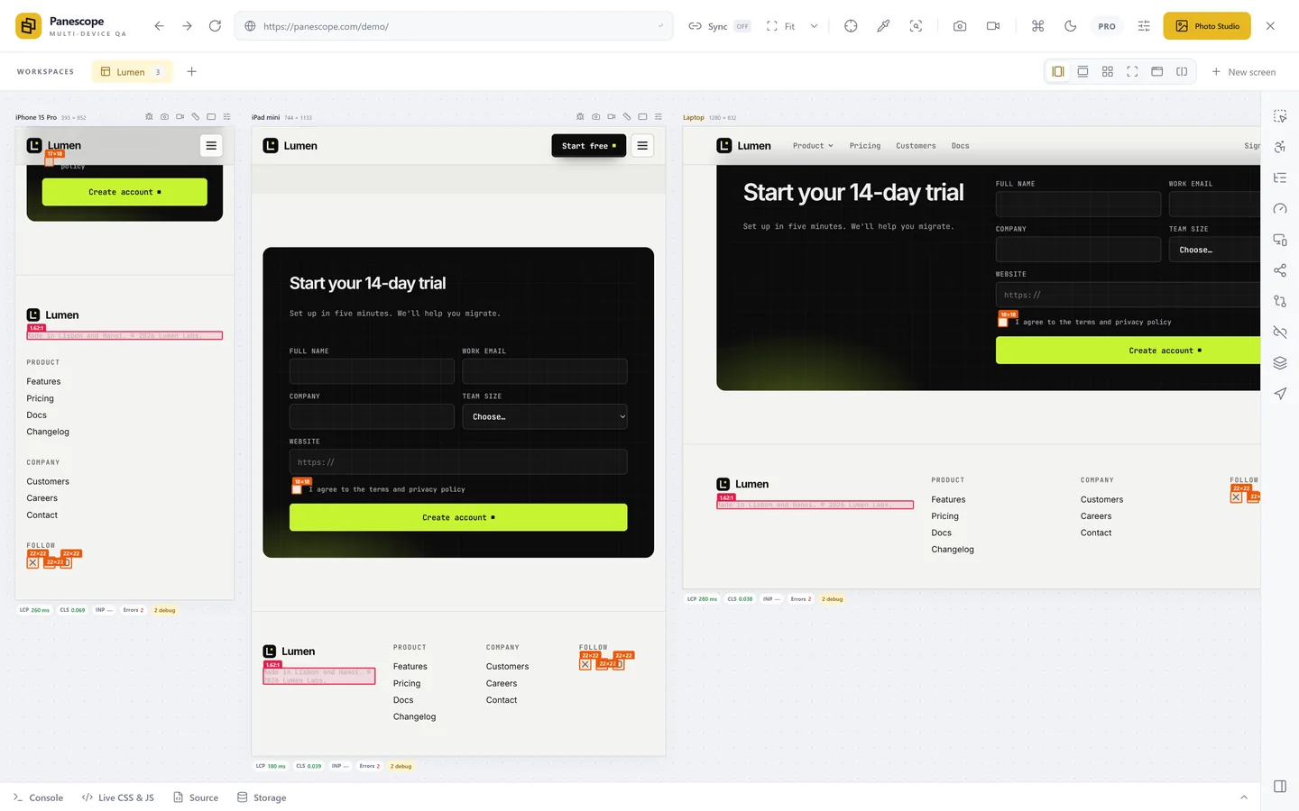
These show the same page at several sizes side by side and keep them in sync. The difference between them is mostly where they run.
| Tool | Runs as | Price |
|---|---|---|
| Panescope | Chrome extension | Free plan; Pro $9/month |
| Polypane | Desktop browser | From €12/month, 14-day trial |
| Sizzy | Desktop browser | From $15/month, or $499 lifetime |
| Responsively App | Desktop app, open source | Free |
| Responsive Viewer | Chrome extension | Free |
The free tools are good for viewing a page at several sizes. The paid ones add the work you do around it: inspecting and comparing elements, accessibility and performance audits, screenshots and video, reports. We compared the three paid ones in detail in Panescope vs Sizzy vs Polypane.
Real devices in the cloud
Services such as BrowserStack and LambdaTest stream real phones and real browsers, including Safari on iOS and old Android versions. They are the answer to "does it work on that exact device", and they cost more and feel slower than local tools, so most teams use them for a final pass rather than while building.
Your own phone
Still the best test of how a page feels: real touch, real scrolling, a real network. Open your local dev server on your phone through your computer's local IP address, or a tunnel, and keep it next to your keyboard.
How to combine them
- While building: a multi-viewport tool, so every change is seen at every size.
- Before merging: your own phone for feel, and the browser's device mode for a quick check of anything odd.
- Before release: a device cloud for the browsers and devices you don't have.
Panescope is free for up to 3 screens. Pro for 3 days, no card needed.