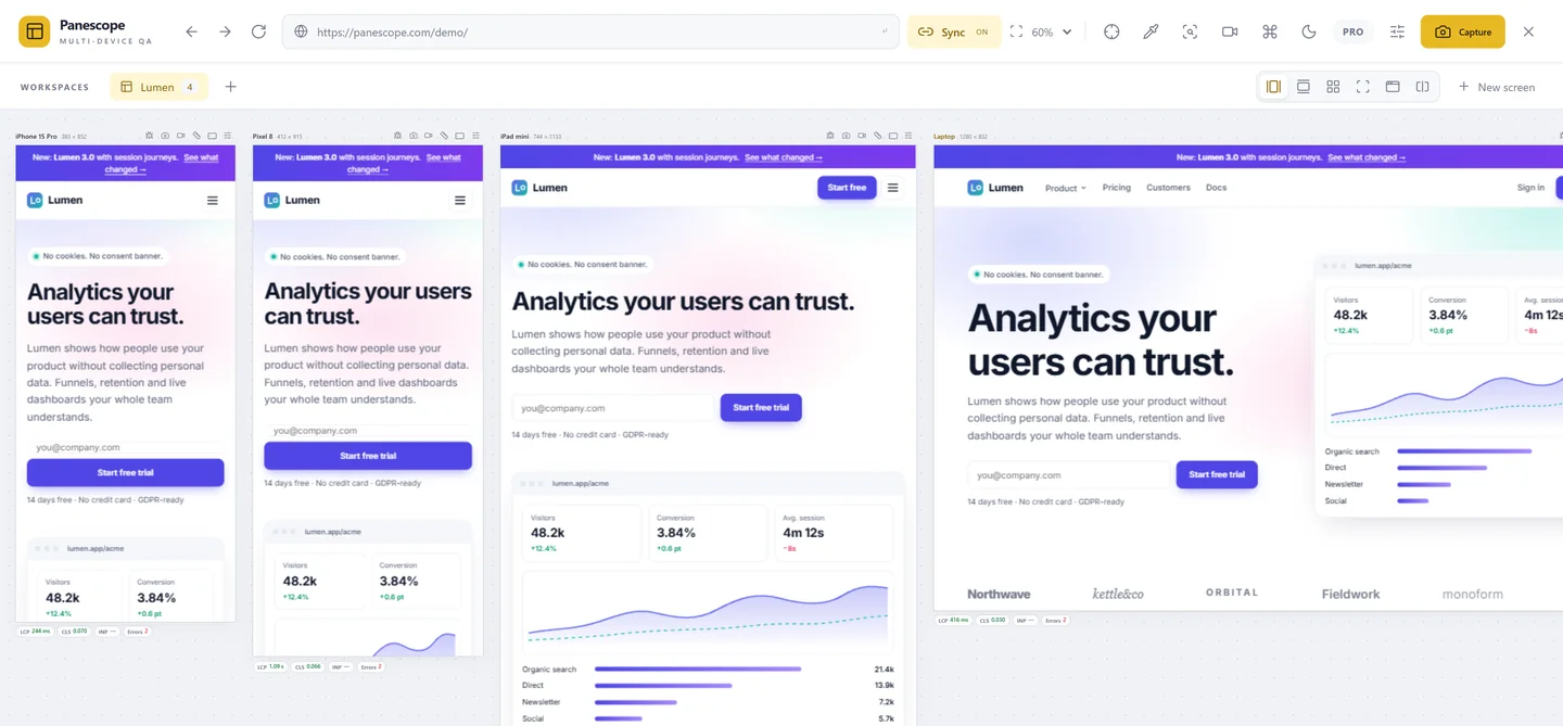
Every screen size. One page. In sync.
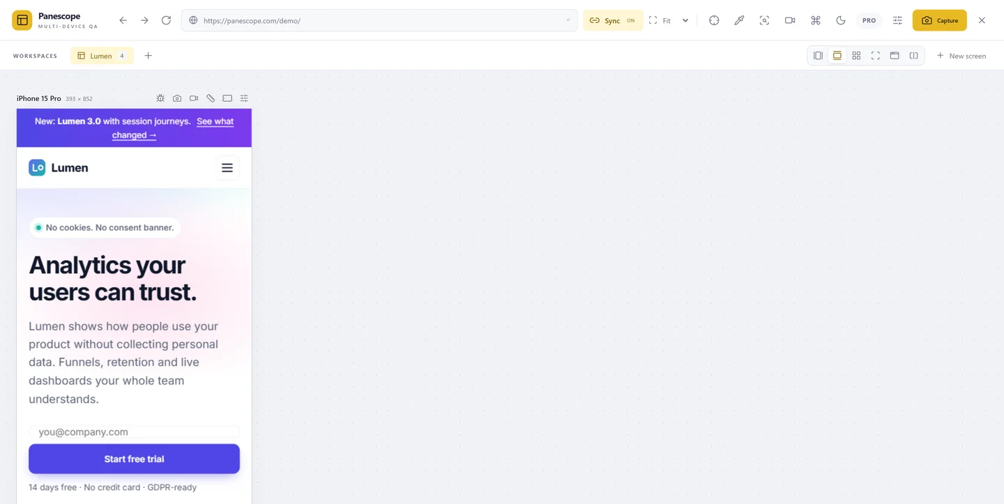
Open your site in phones, tablets and laptops side by side, at their real CSS size and pixel ratio. Scroll, click, hover or type in one and the others follow.

Real screens, not a resized window
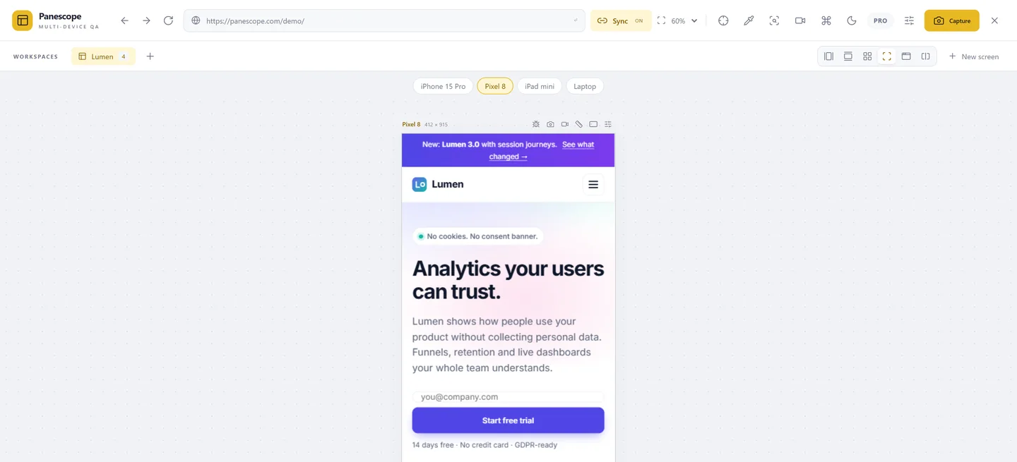
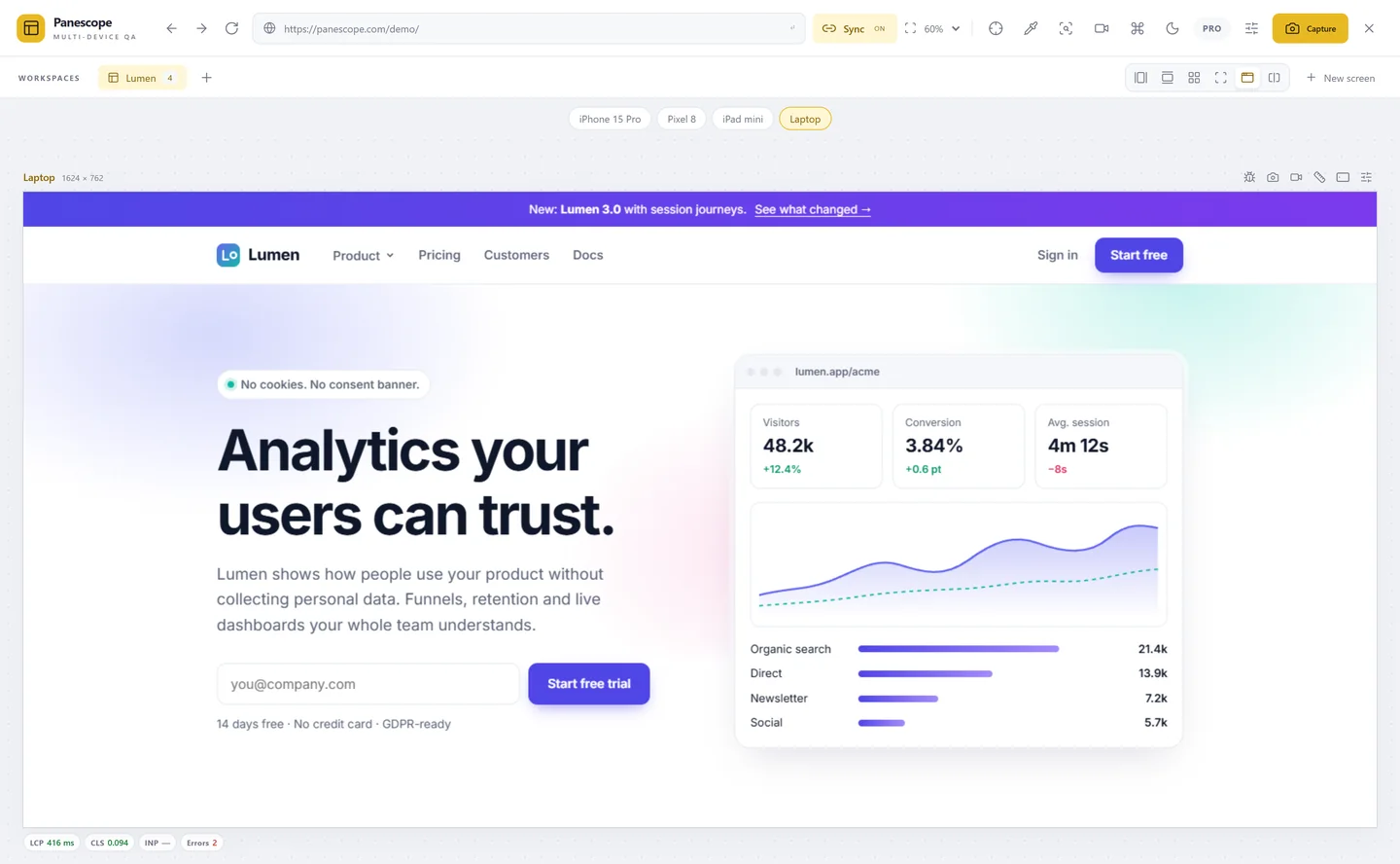
Every screen is a real, interactive page at its exact CSS width, height and device pixel ratio. Media queries, srcset and min-resolution behave like on the device.
- Up to 3 screens free, unlimited with Pro
- Drag an edge to resize, or rotate a screen
- Workspaces as tabs: one per project or flow
- The original tab stays untouched
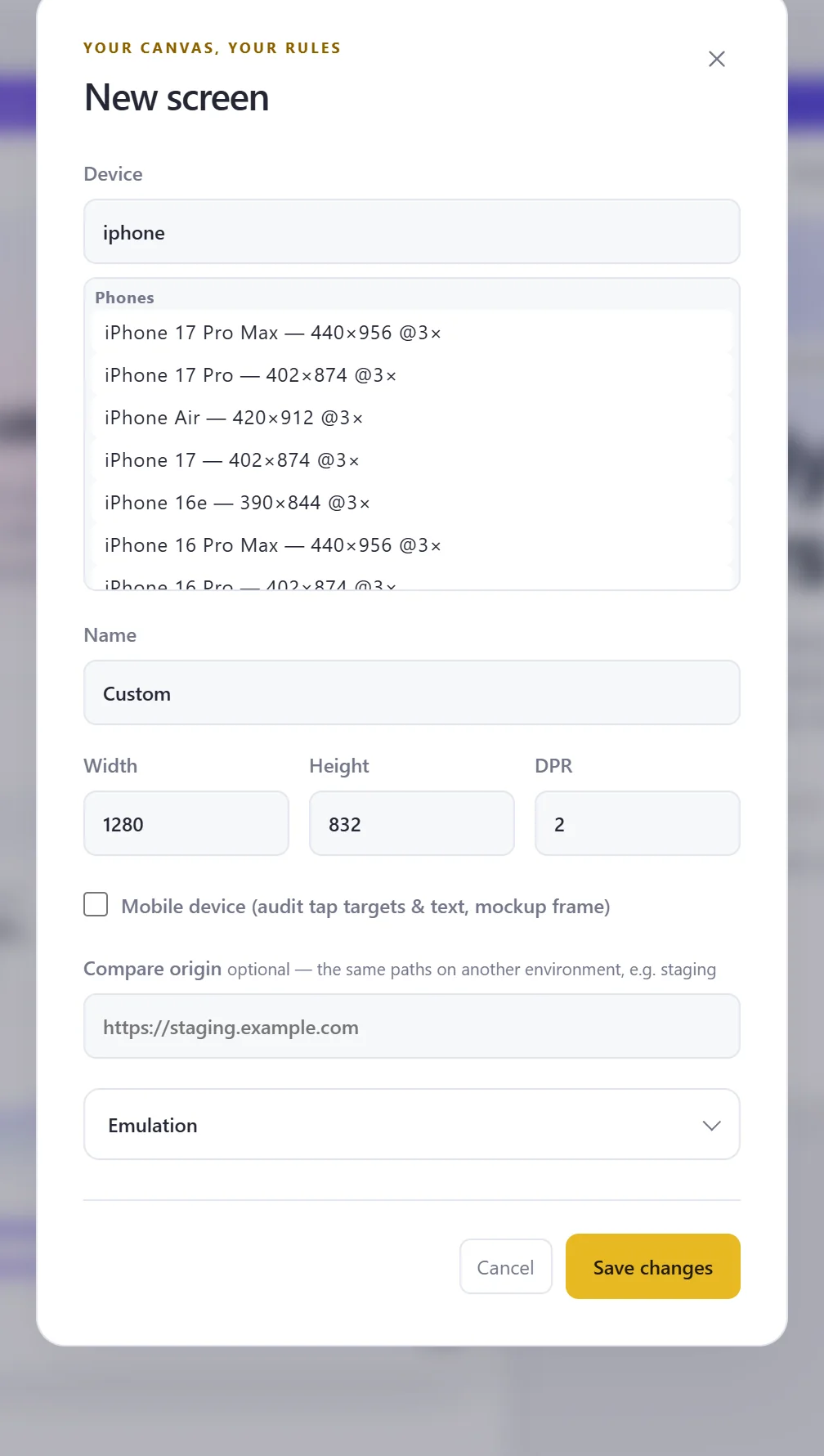
56 devices, plus your own
Search iPhones, Pixels, Galaxys, foldables, iPads and laptops by name. Save custom sizes and share them as JSON with your team.
- Sizes, DPR and mobile flag set for you
- Custom devices saved in Settings › Devices
- Export and import devices and workspaces
Sync scroll, clicks, hover and typing
Interact with one screen and every other screen does the same: same scroll position, same page, same open menu, same text in the form. Password fields are never synced.
- Scroll synced by relative position
- Navigation, clicks and form input repeated
- Hover sync opens :hover menus and JavaScript tooltips everywhere
- Turn each kind on or off in Settings › Sync
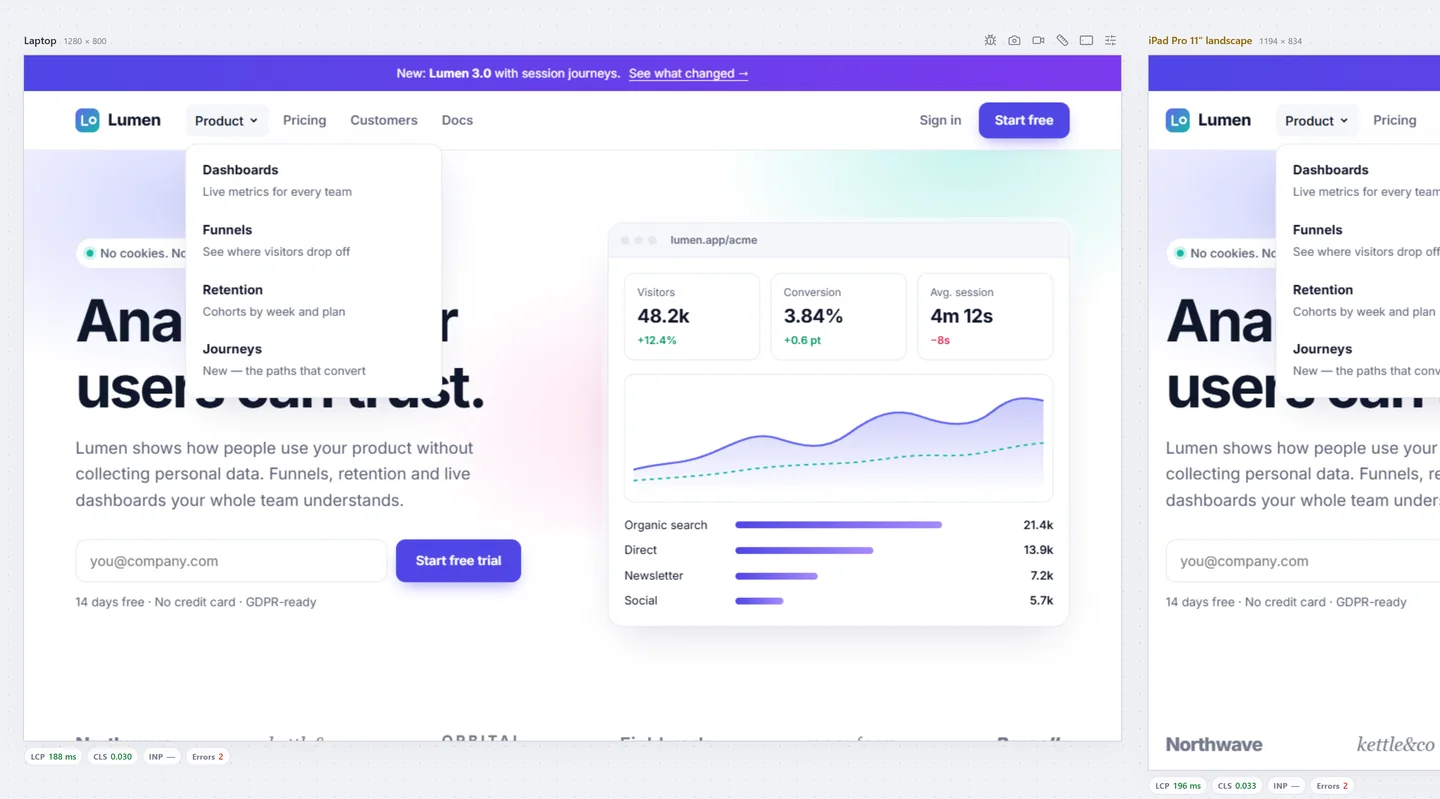
Hover sync. Hovering the Product menu on the laptop opens it on the iPad too.
Six layouts for six kinds of work
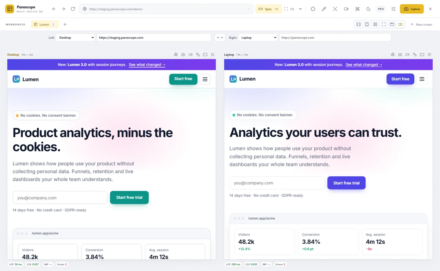
A row to compare, a column for long pages, a grid that fits everything, Focus for one screen, Full for a browser-sized view and Split for two versions side by side.
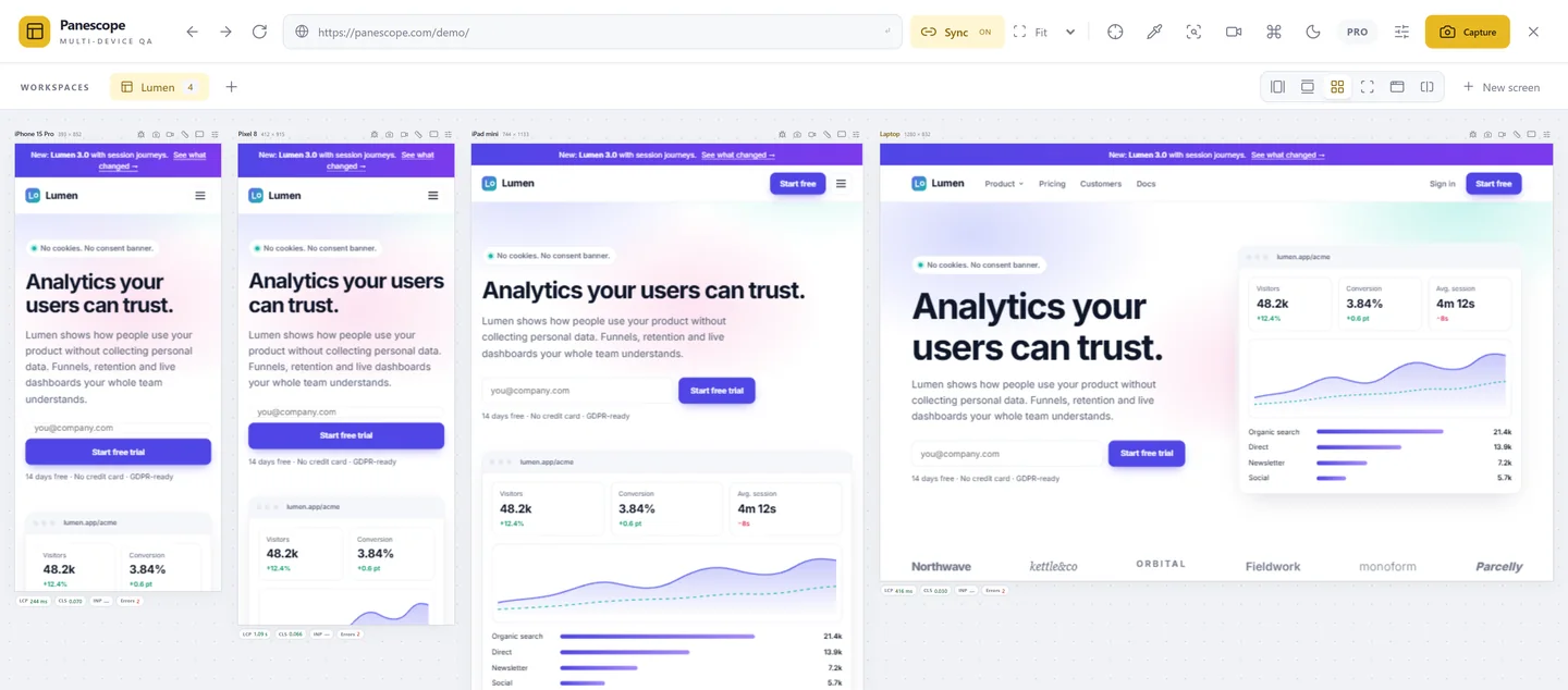
Production next to staging
Give a screen another origin and it loads the same path there. Split shows both halves, navigates them together and keeps their scroll in step.
- Any origin: staging, preview deployments, localhost
- Paths stay identical while you browse
- Swap sides with one click
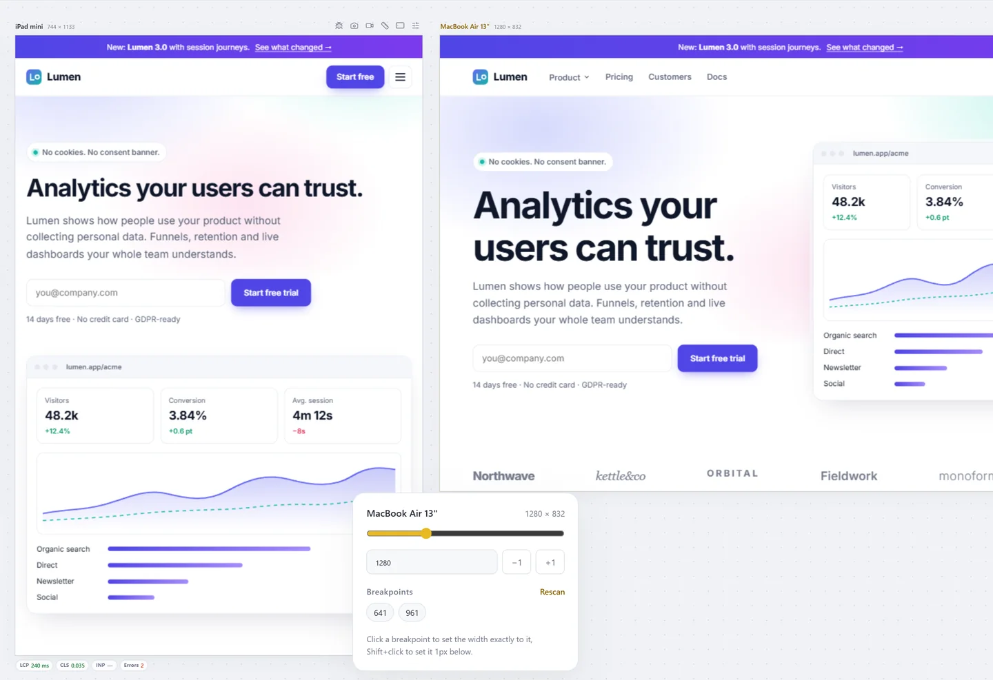
Breakpoints read from your CSS
Drag a width slider and jump to the exact breakpoints of the page, read from every stylesheet, including the ones on other origins. One click creates a screen for each.
- Click a breakpoint to set the width, Shift+click for 1px below
- Screens from CSS breakpoints, or both sides of each (Pro)
- Rulers, guides and a reference image overlay (Pro)
Color scheme and device emulation per screen
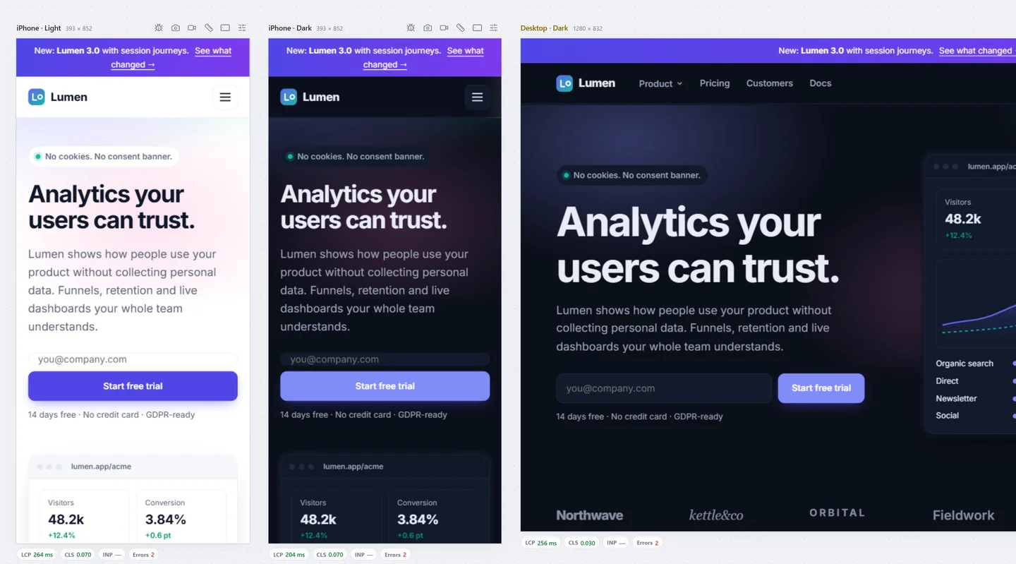
Show light and dark side by side, or one screen on a slow network with a mobile user agent. Emulation is per screen, so the comparison is the point.
- Light, dark or the site default per screen (free)
- Mobile user agent from the first request, language, location, JavaScript off
- Network and CPU throttling, touch, reduced motion, timezone, font size, safe-area insets
Also in Responsive
Context menu everywhere
Right-click any screen for Inspect, Audit, Debug tools, Emulate, Screenshot, Record and Report issue.
Command palette
Ctrl+K finds every action, device and setting. Shortcuts work even while a screen has focus.
Rulers & guides
Pixel rulers on any screen, draggable guides and a reference image to compare with a design.
Workspaces
Several workspaces per window, each with its own screens, renamed, duplicated or deleted from the tab.
Live reload
Watch HTML, CSS and JS on the same origin and reload every screen, keeping the scroll position.
11 languages
English, Tiếng Việt, 简体中文, Español, Português, 日本語, 한국어, Deutsch, Français, Русский, हिन्दी.
Test every screen before your users do.
Free to start. Pro for 3 days without a card.