Viewport sizes for iPhone, Android, iPad and laptops (2026)
CSS viewport widths, heights and device pixel ratios of current iPhones, Android phones, foldables, tablets and laptops, in one table.
A viewport size is the width and height a device gives a web page, in CSS pixels. It is not the screen's resolution: an iPhone 17 Pro has a 1206 × 2622 pixel panel, but a page sees 402 × 874, because each CSS pixel is drawn with 3 × 3 physical pixels. That factor is the device pixel ratio (DPR).
The tables below come from Panescope's device library, which we keep for the extension. Sizes are in portrait for phones and tablets and in landscape for laptops. Sources: Apple's published logical resolutions, Chrome DevTools' emulated devices and measured viewport data.
iPhone
| Device | Viewport (CSS px) | DPR |
|---|---|---|
| iPhone 17 Pro Max | 440 × 956 | 3 |
| iPhone Air | 420 × 912 | 3 |
| iPhone 17 Pro | 402 × 874 | 3 |
| iPhone 17 | 402 × 874 | 3 |
| iPhone 16 Pro Max | 440 × 956 | 3 |
| iPhone 16 Plus | 430 × 932 | 3 |
| iPhone 16 | 393 × 852 | 3 |
| iPhone 16e | 390 × 844 | 3 |
| iPhone 15 Pro Max | 430 × 932 | 3 |
| iPhone 15 / 15 Pro | 393 × 852 | 3 |
| iPhone 14 | 390 × 844 | 3 |
| iPhone 13 mini | 375 × 812 | 3 |
| iPhone SE (3rd gen) | 375 × 667 | 2 |
Android phones
| Device | Viewport (CSS px) | DPR |
|---|---|---|
| Pixel 10 | 412 × 924 | 2.625 |
| Pixel 9 Pro XL | 448 × 997 | 3 |
| Pixel 9 Pro | 427 × 952 | 3 |
| Pixel 9 | 412 × 924 | 2.625 |
| Pixel 8 | 412 × 915 | 2.625 |
| Galaxy S25 Ultra | 384 × 832 | 2.8125 |
| Galaxy S25 | 360 × 780 | 3 |
| Galaxy S24 | 360 × 780 | 3 |
| Galaxy A55 | 384 × 832 | 2.8125 |
| Generic Android | 360 × 800 | 3 |
Foldables
| Device | Viewport (CSS px) | DPR |
|---|---|---|
| Galaxy Z Fold 6, folded | 369 × 905 | 2.625 |
| Galaxy Z Fold 6, unfolded | 707 × 823 | 2.625 |
| Pixel 9 Pro Fold, folded | 412 × 922 | 2.625 |
| Pixel 9 Pro Fold, unfolded | 791 × 820 | 2.625 |
| Galaxy Z Flip 6 | 360 × 880 | 3 |
Tablets
| Device | Viewport (CSS px) | DPR |
|---|---|---|
| iPad mini (A17 Pro) | 744 × 1133 | 2 |
| iPad (A16) | 820 × 1180 | 2 |
| iPad Air 11-inch (M3) | 820 × 1180 | 2 |
| iPad Pro 11-inch (M4) | 834 × 1210 | 2 |
| iPad Air 13-inch (M3) | 1024 × 1366 | 2 |
| iPad Pro 13-inch (M4) | 1032 × 1376 | 2 |
| Galaxy Tab S9 | 800 × 1280 | 2 |
| Surface Pro 7 | 912 × 1368 | 2 |
Laptops and desktops
| Device | Viewport (CSS px) | DPR |
|---|---|---|
| Laptop HD | 1280 × 720 | 1 |
| Laptop | 1366 × 768 | 1 |
| Desktop | 1440 × 900 | 1 |
| MacBook Air 13 (M4) | 1470 × 956 | 2 |
| MacBook Pro 14 | 1512 × 982 | 2 |
| Windows laptop, 1080p at 125% | 1536 × 864 | 1.25 |
| MacBook Air 15 (M4) | 1710 × 1112 | 2 |
| MacBook Pro 16 | 1728 × 1117 | 2 |
| Full HD | 1920 × 1080 | 1 |
| QHD | 2560 × 1440 | 1 |
What to do with these numbers
- Design breakpoints around your content, not around devices; then check the devices that sit just above and below each breakpoint.
- Always test 360 px wide: it is still the narrowest common phone, and the most likely to overflow.
- Serve images for the DPR: a 400 px wide image slot on a DPR 3 phone needs a 1200 px image to look sharp.
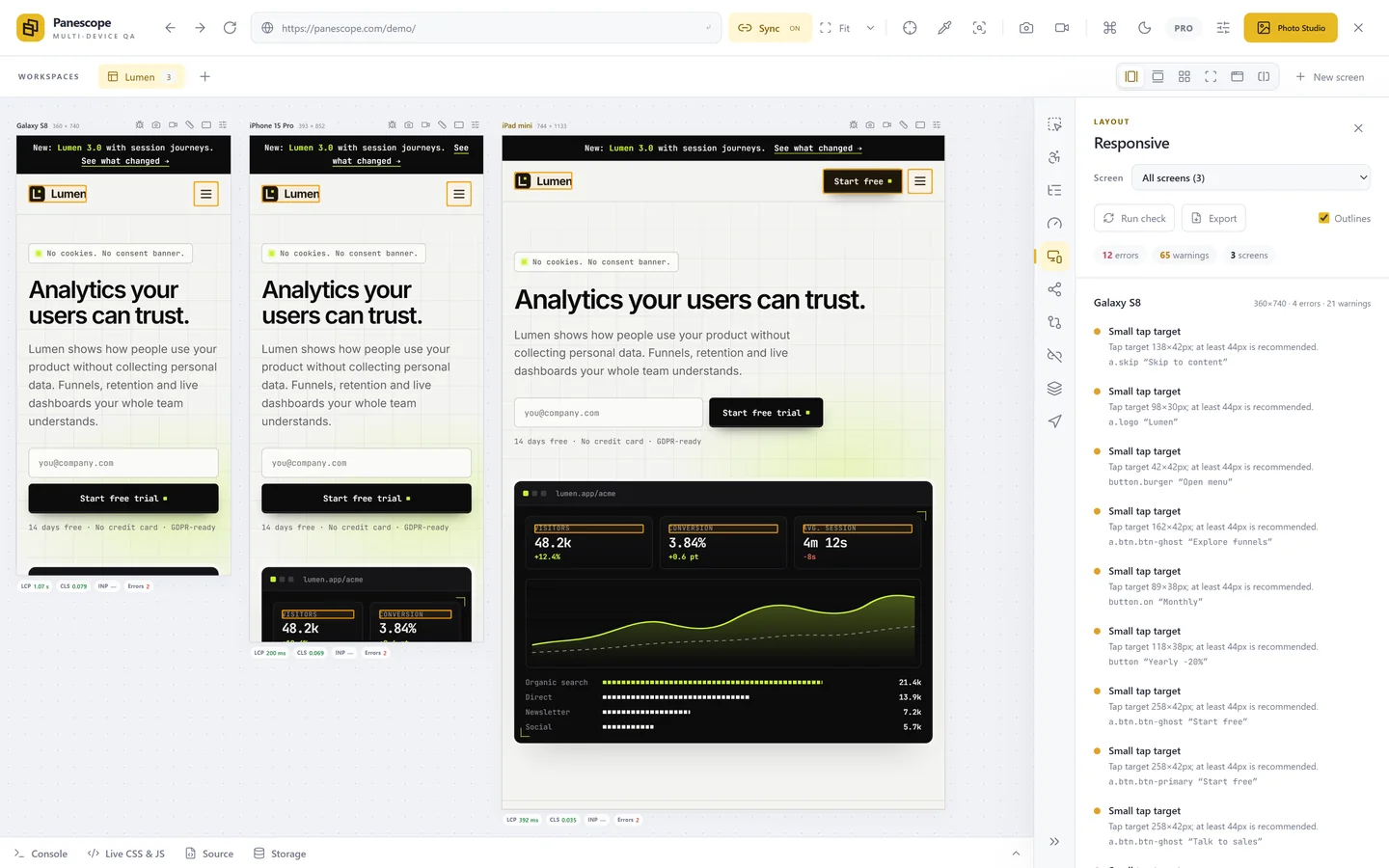
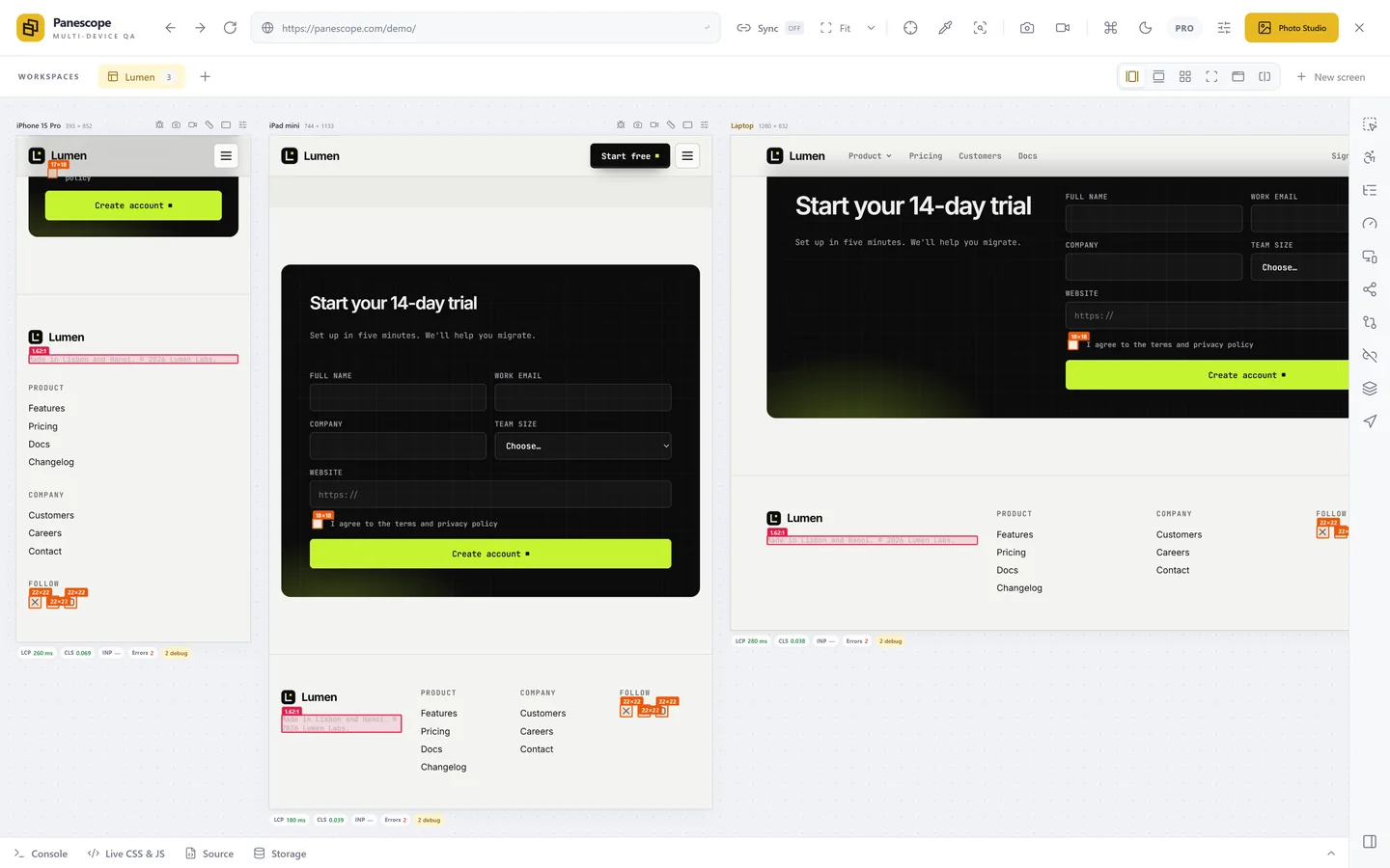
Panescope includes all of these devices (and custom ones you add), each with its size, DPR and user agent, so you can open several at once. See how to test on multiple devices at once.
Panescope is free for up to 3 screens. Pro for 3 days, no card needed.