How to make device mockup screenshots of your website
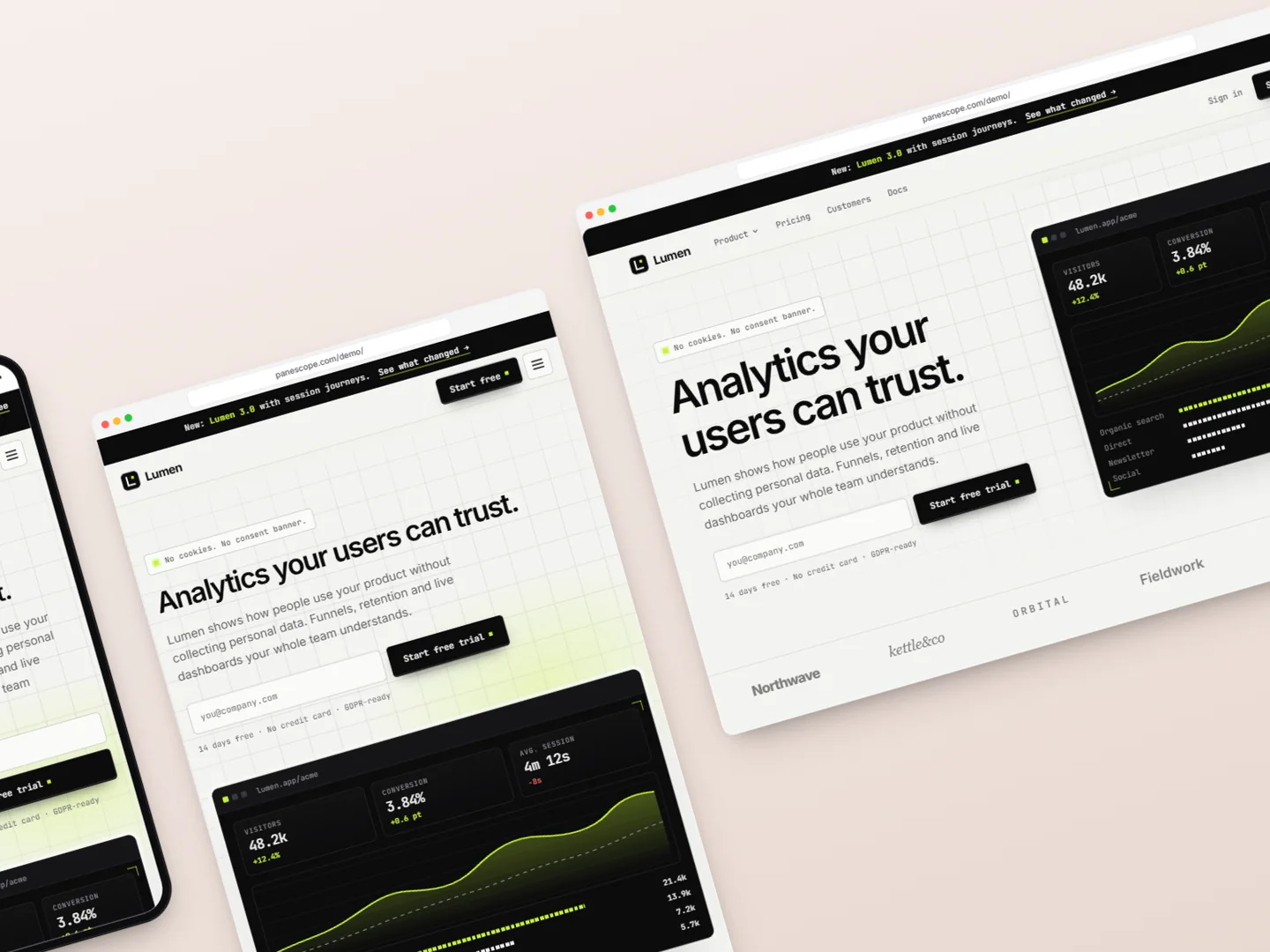
Turn your live website into launch images: phones, tablets and laptops in device frames, on a background, with a headline and callouts, without a design tool.
Every launch needs the same pictures: the product on a phone, a tablet and a laptop, on a nice background, sized for Product Hunt, X or the App Store. The usual route is screenshots, a mockup template and an hour in a design tool, repeated every time the product changes.
What makes a good device mockup
- Real content. Show a state people recognise: a filled dashboard, an open menu, a finished form. Not an empty page.
- Sharp at any size. Capture at 2× or more so text stays crisp when the image is scaled by a social network.
- One message. A short headline and, at most, one or two callouts that point at the detail you want people to notice.
- The right size for where it goes: 1270 × 760 for Product Hunt, 1600 × 900 for X, 1080 × 1080 for Instagram.
Making them from the live page
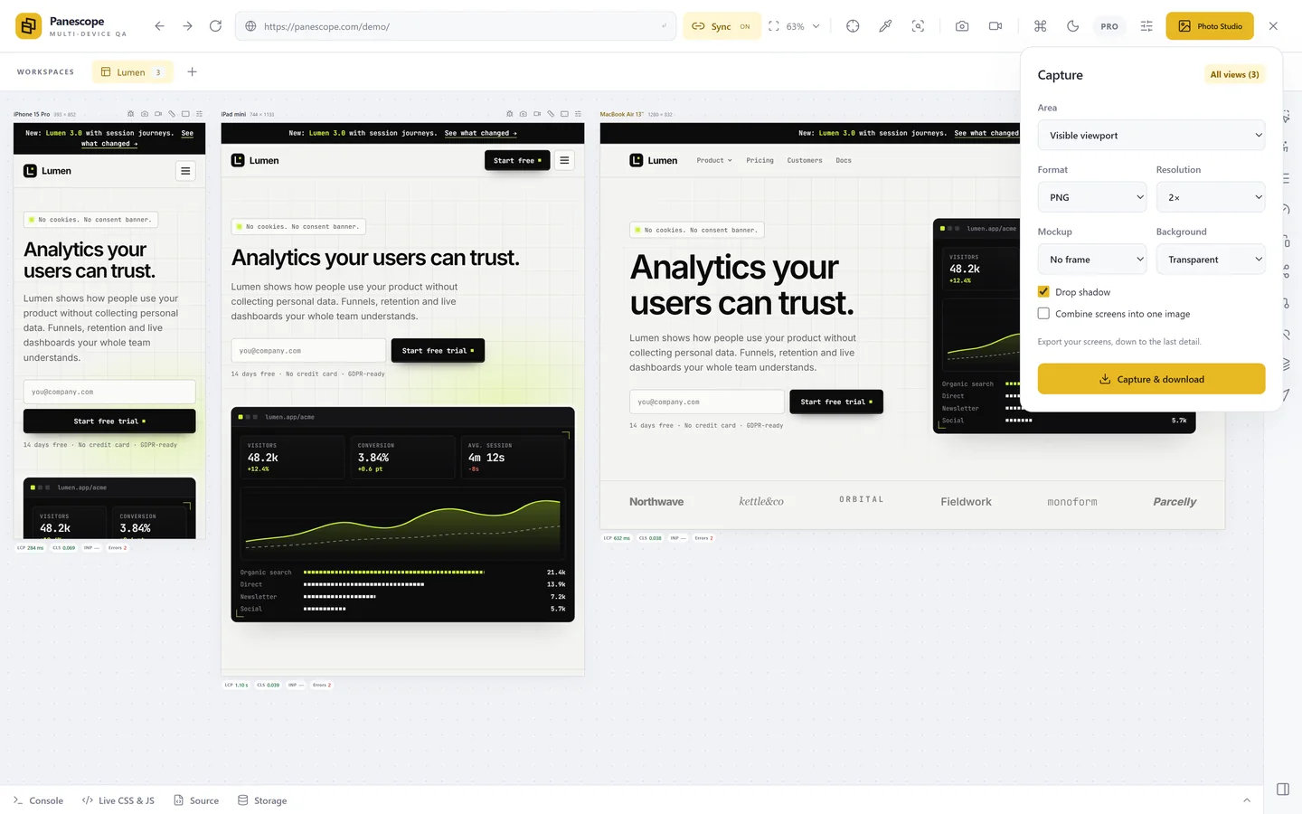
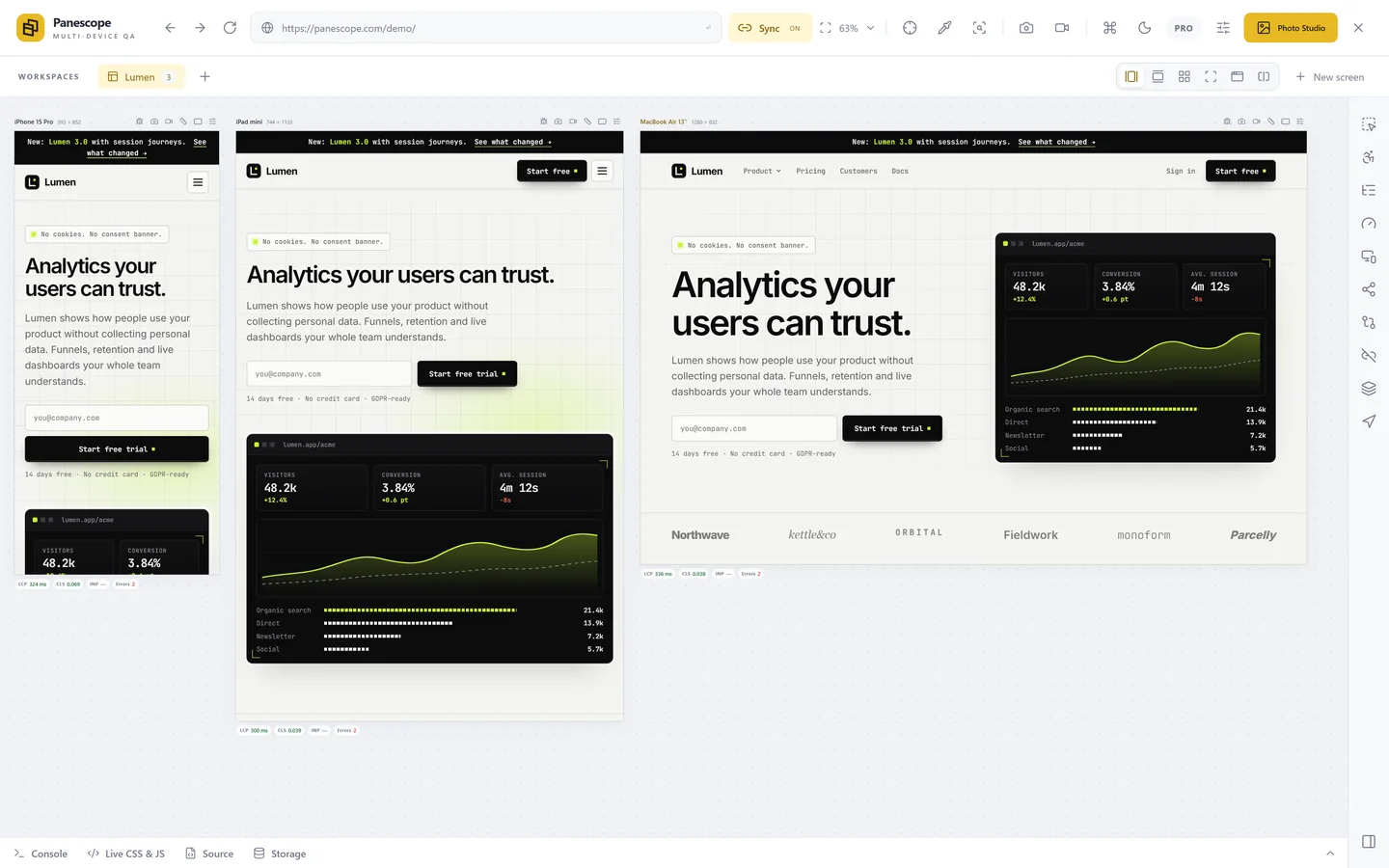
Photo Studio in Panescope puts your real screens on a canvas, still live: scroll a page, open a menu or type into a form, then frame that moment.
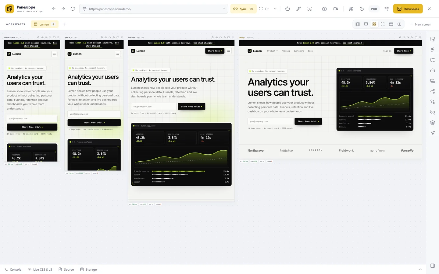
- Open your site in Panescope with the devices you want, and choose Photo Studio in the toolbar.
- Pick a template (Product Hunt, X, LinkedIn, Instagram, YouTube, App Store…) or an arrangement: row, grid, showcase, 3D or isometric.
- Give each screen a device frame or a browser window, choose a solid, gradient or image background, and write the headline.
- Drag over a detail to make a callout: an enlarged, sharp copy of that region with a line back to where it came from.
- Export a PNG at 1×, 2× or 4× the canvas size.
From pictures to video
Save the canvas as scenes, each with its own layout and scroll positions, and Photo Studio animates between them. Record that as an MP4, WebM or GIF for a launch post or a landing page.
Panescope is free for up to 3 screens. Pro for 3 days, no card needed.