How to find what causes horizontal scroll on mobile
A page that scrolls sideways on phones almost always has one element wider than the viewport. Here is how to find it fast, and the usual culprits.
You open the page on a phone, swipe up, and the whole page wobbles sideways. Somewhere, one element is wider than the screen. The fix is usually one line of CSS; finding the element is the hard part.
Find it with a snippet
Paste this into the console at the width where the page overflows. It lists every element whose right edge goes past the viewport, outermost first:
const width = document.documentElement.clientWidth;
const wide = [...document.querySelectorAll('body *')].filter((element) => {
  const box = element.getBoundingClientRect();
  return box.width > 0 && (box.right > width + 1 || box.left < -1);
});
wide.forEach((element) => { element.style.outline = '2px solid red'; });
console.table(wide.slice(0, 20).map((element) => ({
  element: element.tagName.toLowerCase() + (element.className ? '.' + String(element.className).split(' ')[0] : ''),
  left: Math.round(element.getBoundingClientRect().left),
  right: Math.round(element.getBoundingClientRect().right)
})));
The first rows are usually the cause; the rest are its children. Elements hidden with overflow: hidden on a parent may be listed but don't cause scrolling, so check the outermost one first.
The usual suspects
width: 100vw. On desktops with visible scrollbars,100vwincludes the scrollbar, so the element is about 17 px too wide. Use100%or let block elements fill their parent.- Fixed widths. A
width: 400pxcard or table on a 360 px phone. Usemax-width: 100%, ormin():width: min(400px, 100%). - Long words and URLs. An email address or link with no break points. Add
overflow-wrap: anywhereto the text container. - Images and embeds without
max-width: 100%, especially iframes from video and map providers. - Flex and grid children that refuse to shrink. Flex items default to
min-width: auto, and a grid track of1fris reallyminmax(auto, 1fr). Setmin-width: 0on the item, or useminmax(0, 1fr). - Negative margins and off-screen decorations: a blurred blob positioned at
right: -200px, a carousel's next slide.
Catch it on every screen
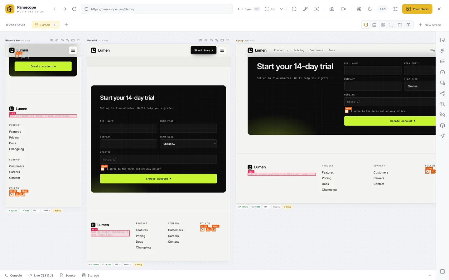
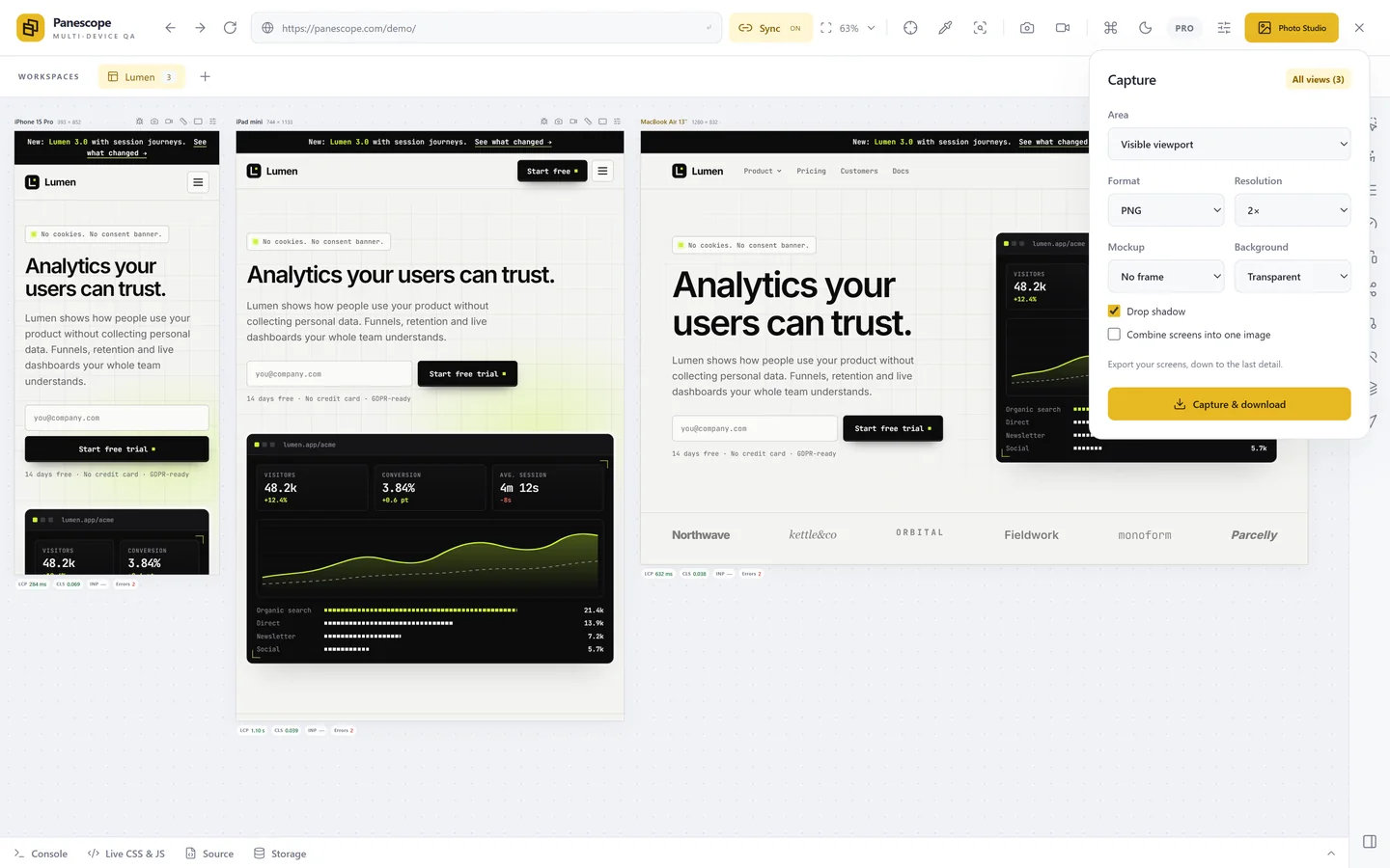
Overflow often appears at only one width. Panescope's responsive check outlines overflowing elements on every screen at once, flags small tap targets and small text in the same pass, and shows the overflow in each screen's status bar while you work.
Panescope is free for up to 3 screens. Pro for 3 days, no card needed.