How to test color contrast against WCAG 2.2
The contrast ratios WCAG requires for text and interface parts, how the ratio is calculated, the cases tools miss, and how to check a whole page.
Low contrast is the most common accessibility failure on the web, and one of the easiest to fix once you can see it. Here is what the rules ask for and how to check a page against them.
The ratios WCAG asks for
| What | Level AA | Level AAA | Criterion |
|---|---|---|---|
| Normal text | 4.5 : 1 | 7 : 1 | 1.4.3, 1.4.6 |
| Large text (24 px, or 18.66 px bold) | 3 : 1 | 4.5 : 1 | 1.4.3, 1.4.6 |
| Icons, input borders, focus indicators | 3 : 1 | n/a | 1.4.11 |
Disabled controls, decorative text and logos are exempt. Placeholder text is not: if it carries information, it needs 4.5 : 1 like any other text.
How the ratio is calculated
Each colour is converted to its relative luminance, a value from 0 (black) to 1 (white) that weights green most and blue least, the way our eyes do. The ratio is the lighter luminance plus 0.05, divided by the darker plus 0.05:
const channel = (value) => {
  const c = value / 255;
  return c <= 0.04045 ? c / 12.92 : Math.pow((c + 0.055) / 1.055, 2.4);
};
const luminance = ([r, g, b]) => 0.2126 * channel(r) + 0.7152 * channel(g) + 0.0722 * channel(b);
const contrast = (a, b) => {
  const [light, dark] = [luminance(a), luminance(b)].sort((x, y) => y - x);
  return (light + 0.05) / (dark + 0.05);
};
contrast([118, 118, 118], [255, 255, 255]); // 4.54: #767676 on white just passes AA
The cases that slip through
- Text on images and gradients. The contrast changes across the image; check the worst spot, and add an overlay if needed.
- Opacity. Text at
opacity: 0.6is lighter than its colour value says. - States. Hover, focus, visited and disabled colours each need checking.
- Dark mode. A palette that passes in light mode often fails in dark, especially greys and brand colours.
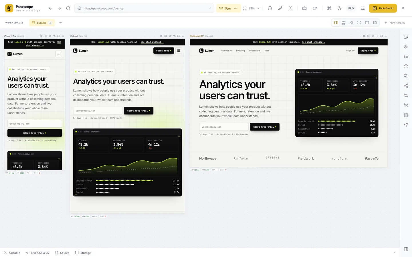
- Different layouts. On a phone the same heading may sit on the image instead of beside it.
Check a whole page, on every screen
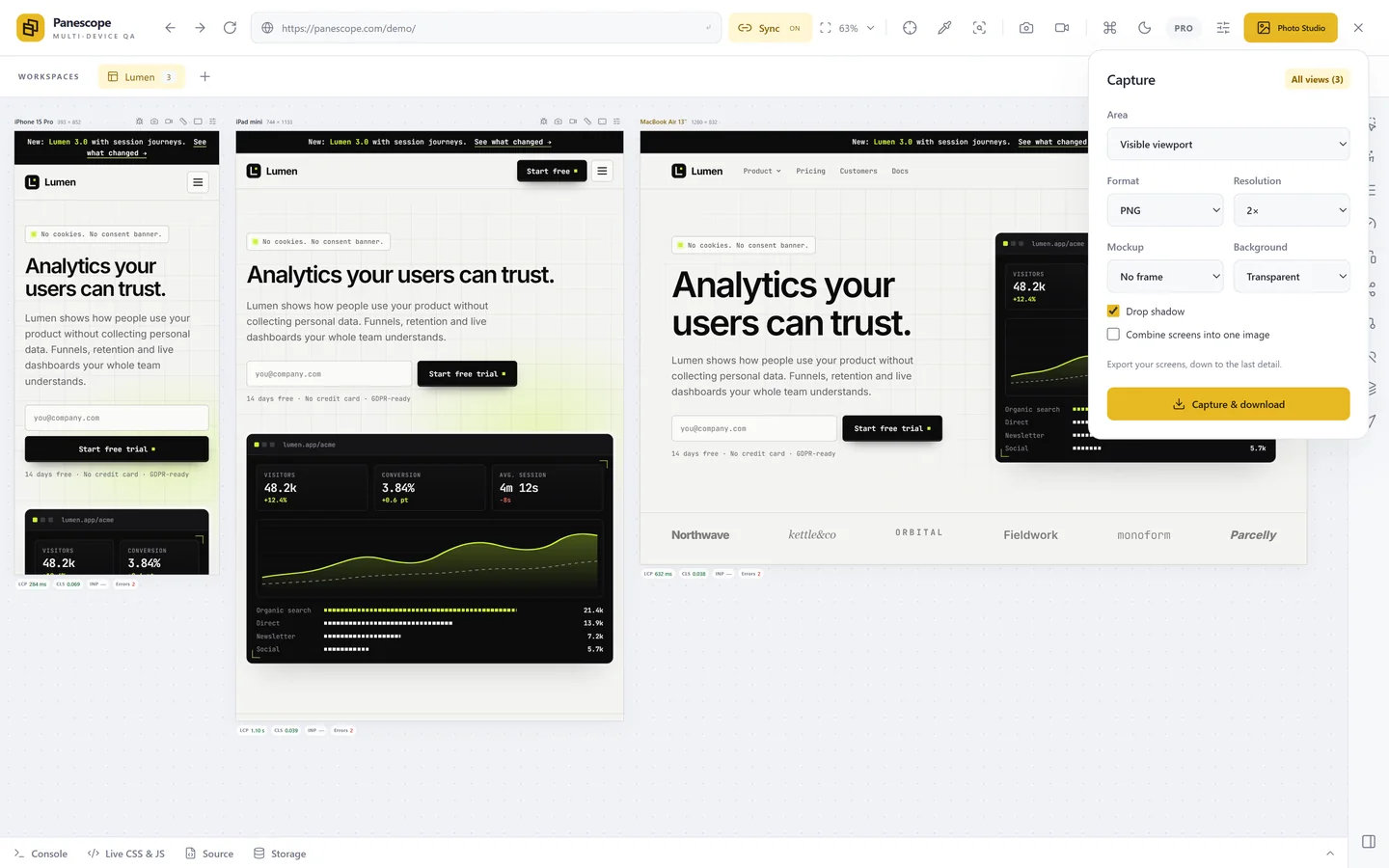
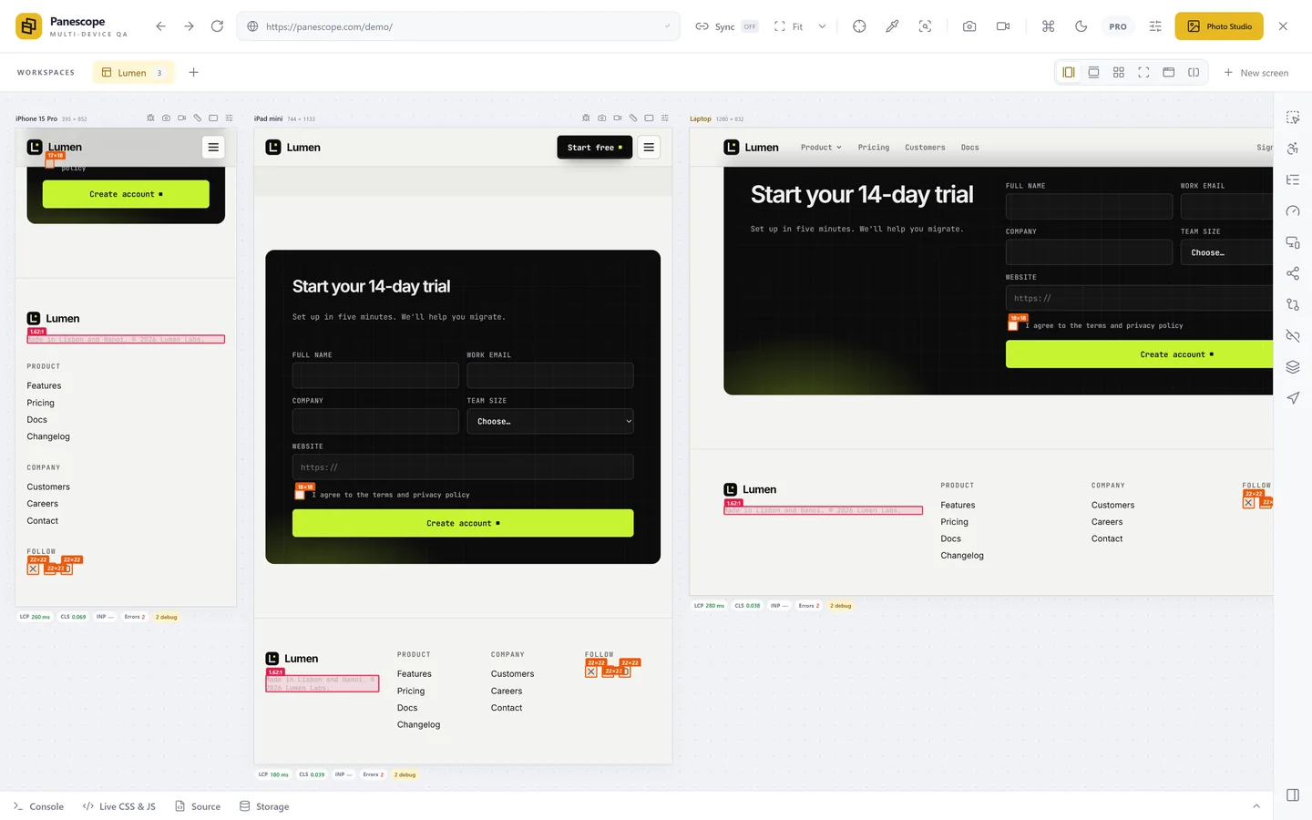
Chrome DevTools shows the ratio of one element in its colour picker, and an automated audit such as axe-core finds most failures. Panescope runs both ideas on the live page: the contrast overlay marks every text below AA or AAA where it is, on every screen at once, and the WCAG 2.2 audit lists the failures with the screens they affect. Hover any text with Inspect to see its exact ratio.
Panescope is free for up to 3 screens. Pro for 3 days, no card needed.