Chrome DevTools device mode: 6 things it doesn't show you
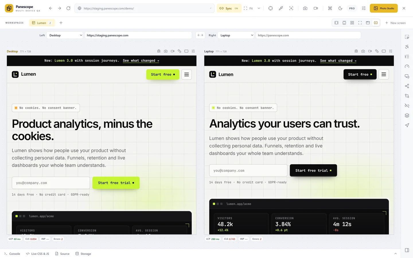
Device mode is a great start, but it shows one viewport at a time and skips several things real phones do. Here is what it misses and how to cover it.
Chrome DevTools' device mode is where most responsive testing begins: pick an iPhone from the list, reload, look. It is free, it is always there, and it gets the basics right: CSS width, height, pixel ratio, user agent and touch. Knowing where it stops helps you decide what else you need.
1. One viewport at a time
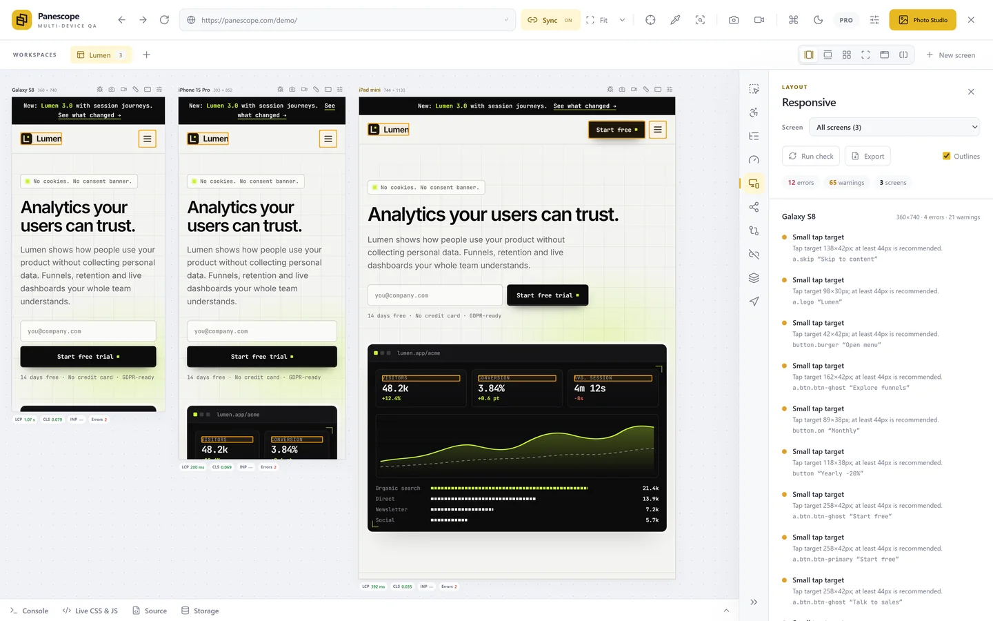
You see one device, then another. Comparing layouts means switching back and forth and trusting your memory, and checking one change at four widths means four rounds of switching. Tools that show several viewports at once, in sync, remove that loop.
2. It is Chromium, not Safari
Picking "iPhone" changes the size and the user agent, not the engine. Real iPhones render with WebKit, so Safari-only bugs (and features Safari doesn't support yet) won't appear. This is true of every Chrome-based tool, Panescope included. Keep a real iPhone, an iOS simulator or a cloud device service for the final check.
3. No browser chrome, so no 100vh surprises
On a phone the address bar and toolbar take space and collapse as you scroll. That is why 100vh sections are cut off on real phones, and why svh, lvh and dvh exist. Device mode gives the page the full height, so these bugs stay hidden. Test with a shorter screen height, or on a real device.
4. No notch
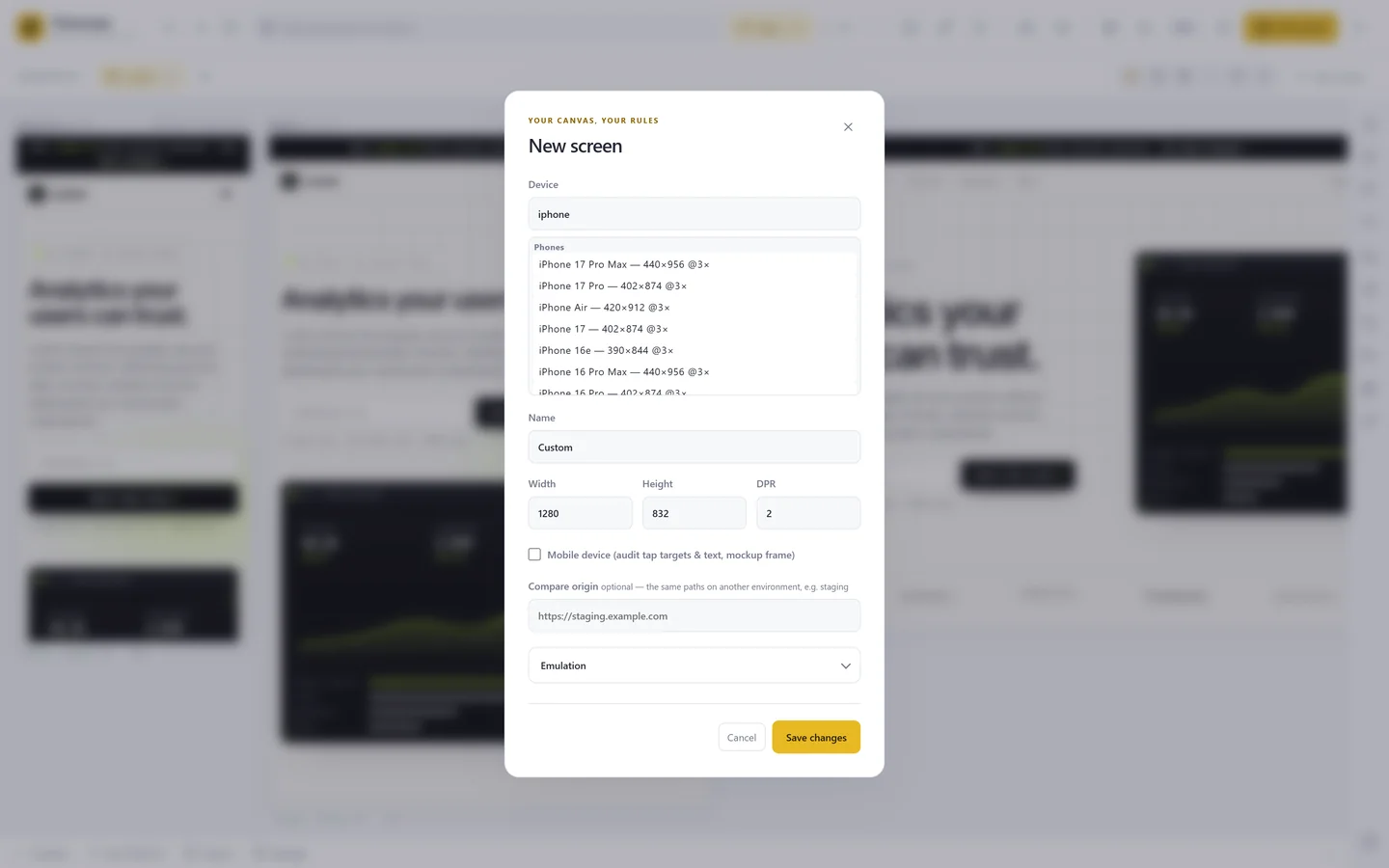
Pages that use env(safe-area-inset-top) to stay clear of the notch and the home indicator get zero insets in device mode, so the padding you wrote is never exercised. Panescope can emulate safe-area insets on a screen, alongside network and CPU throttling, reduced motion and a larger default font size.
5. Your fast computer
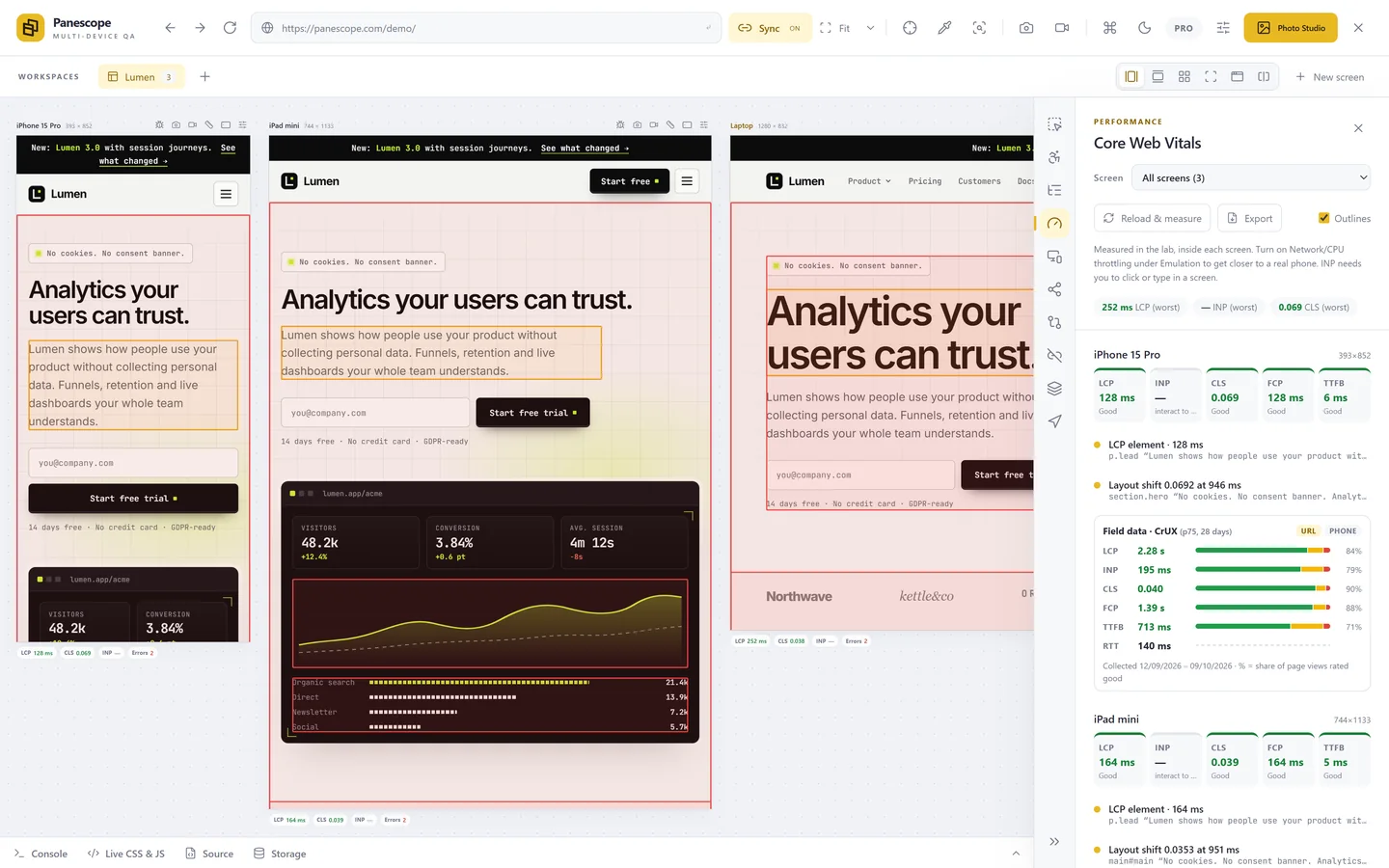
A laptop on office Wi-Fi is many times faster than a mid-range phone on a train. Layout shifts, late fonts and heavy hero images that hurt on a phone barely show. Turn on network and CPU throttling, and look at Core Web Vitals next to real-user data from the Chrome UX Report.
6. Hover still works
With touch emulation on, there is no hover, which is right. But while you design you will often switch devices with a mouse, and menus that only open on hover feel fine until someone taps. Check every hover interaction with touch on, and make sure it has a tap or keyboard equivalent.
Panescope is free for up to 3 screens. Pro for 3 days, no card needed.