How to find the breakpoints of any website
Three ways to list the media query breakpoints of a page: DevTools, a console snippet that reads every stylesheet, and a tool that does it for you.
A breakpoint is a width where a site's CSS changes its layout, usually a @media (min-width: …) or (max-width: …) rule. Knowing them tells you exactly which widths to test, which is far better than guessing at "phone, tablet, desktop".
1. Chrome DevTools
Open DevTools, turn on the device toolbar (Ctrl+Shift+M, or Cmd+Shift+M on a Mac), open its three-dot menu and choose Show media queries. Coloured bars appear above the page; click one to jump to that width. It is quick, but it only shows one viewport at a time and you still have to note the numbers down yourself.
2. A console snippet
Every stylesheet the page loaded is in document.styleSheets. This snippet walks through them, including media rules nested inside other rules, and prints the widths it finds:
const widths = new Set();
const walk = (rules) => {
  for (const rule of rules) {
    if (rule.media) {
      for (const match of rule.media.mediaText.matchAll(/(min|max)-width:\s*([\d.]+)(px|em|rem)/g)) {
        const px = match[3] === 'px' ? Number(match[2]) : Number(match[2]) * 16;
        widths.add(match[1] + ' ' + px);
      }
    }
    if (rule.cssRules) walk(rule.cssRules);
  }
};
for (const sheet of document.styleSheets) {
  try { walk(sheet.cssRules); } catch (error) { console.warn('Cannot read', sheet.href); }
}
console.log([...widths].sort((a, b) => parseFloat(a.split(' ')[1]) - parseFloat(b.split(' ')[1])));
The catch is in the catch: stylesheets served from another origin, such as a CDN, can't be read by page scripts unless the server sends CORS headers. Those breakpoints are silently missing, and on many sites that is most of them.
3. Let the tool read them
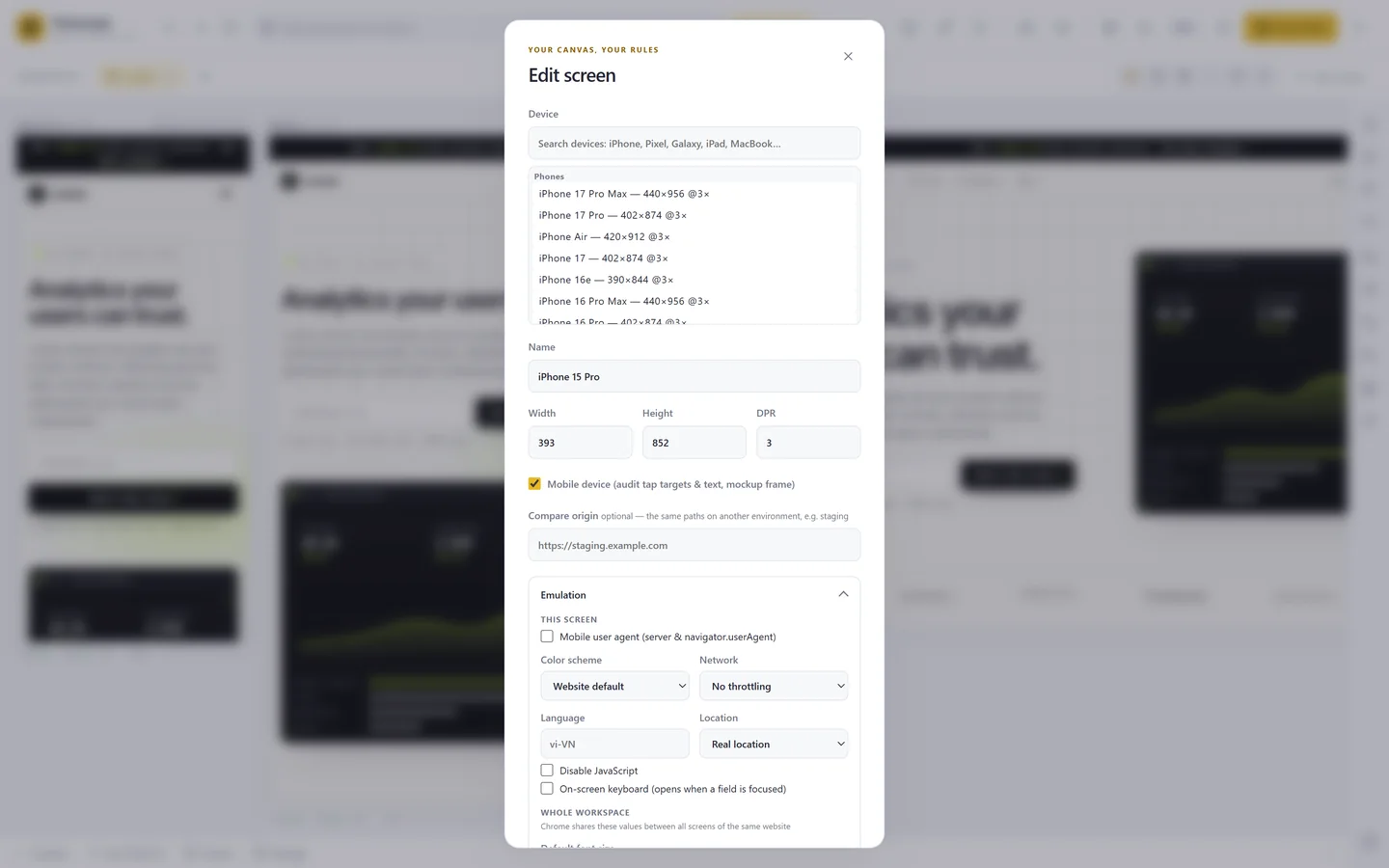
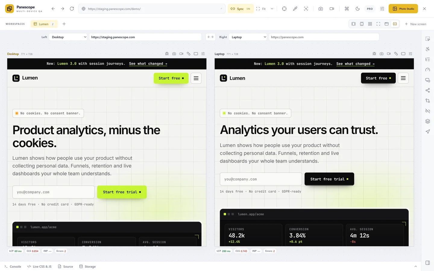
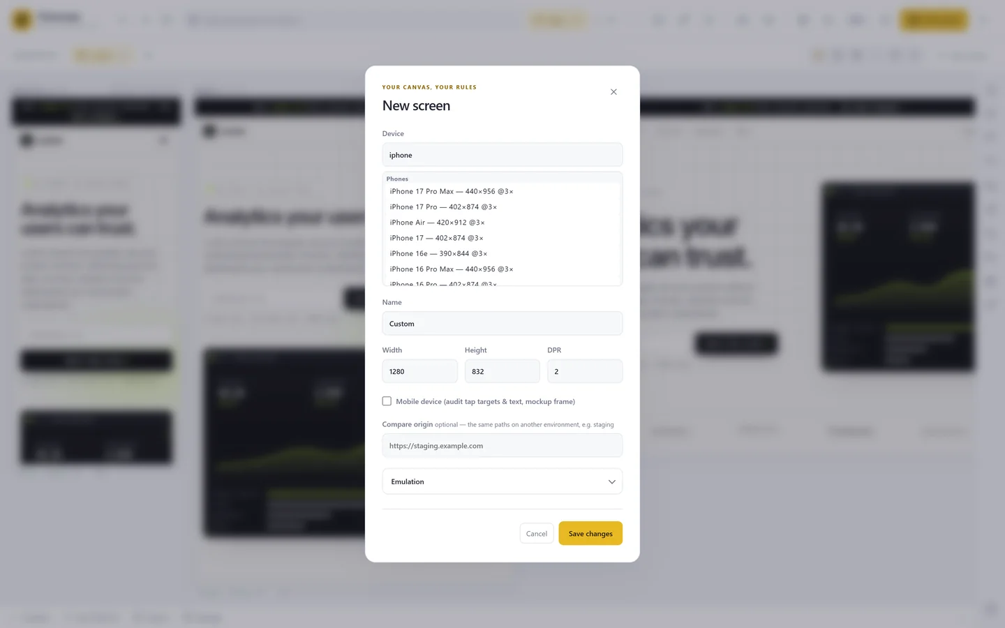
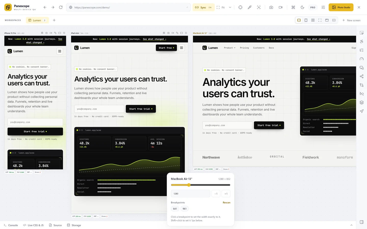
Panescope reads the media queries of every stylesheet on the page, including the ones on other origins, and shows them on a width slider for each screen. Click a breakpoint to set the screen to that width, or Shift+click to land one pixel below it, where the layout is about to change. One click creates a screen for each breakpoint.
What to test once you have them
- Each breakpoint and one pixel below it, where the previous layout is stretched to its limit.
- The space between two far-apart breakpoints, where a layout often looks loose or cramped.
- Widths with a scrollbar: on Windows a desktop scrollbar takes about 17 px, so a 1280 px window has roughly 1263 px for the page.
Read more about choosing sizes in Panescope's responsive tools or in our viewport size table.
Panescope is free for up to 3 screens. Pro for 3 days, no card needed.